These ideas run from a strip of painter’s tape and a steady hand to a wall that needs structural checking before tile goes up, so the real filter is how long you plan to stay and how much you trust your own hands with a miter box.
The post that follows starts with reclaimed barn wood that needs sealing before hot dishes land near it and ends with a plate display that travels with you when the lease ends.
1. Wood Panel Accent Wall
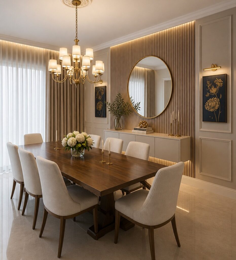
Vertical wood slats cut to staggered lengths turn a flat wall into something that catches light differently as the day moves.
Reclaimed barn wood gives the warmest result, but it needs sealing before it goes up; splinters and moisture damage are real risks near a table where hot dishes land and drinks spill.
Smooth, finished boards read more city apartment than cabin, so the choice depends on whether your room needs roughness or refinement.
I would pick reclaimed only if the dining room gets used hard and the patina matches the rest of the house; otherwise painted or stained new wood is easier to live with.
2. Wall Mural
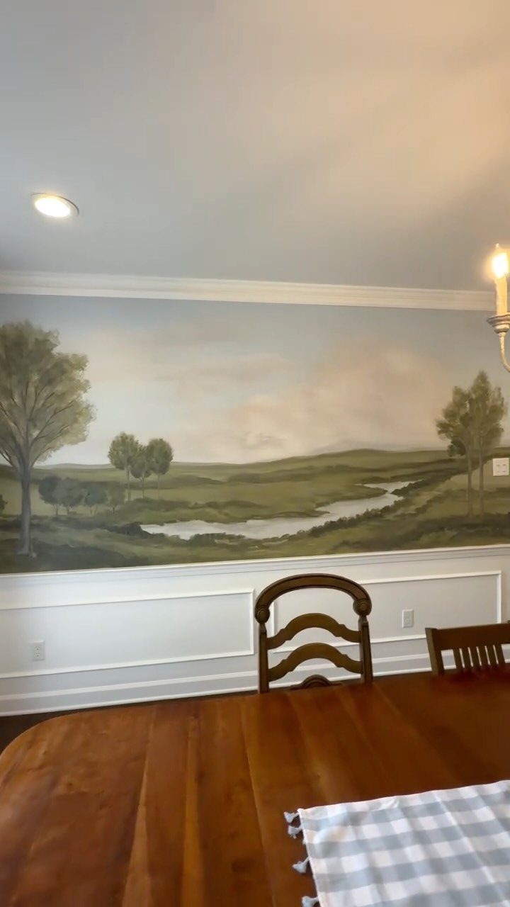
A mural turns the wall itself into the artwork instead of hanging something on it. Hand-painted scenes take time and either skill or hired help, but printed murals now go up like wallpaper and come down again when tastes change.
Landscapes work above wainscoting, though city skylines and botanical line drawings do the same job.
A dark scene in a north-facing dining room can feel like a window that never opens, so I match the image to whatever light the room actually gets.
Renters should look at the peel-and-stick options first, since they leave the wall intact underneath.
3. Textured Wallpaper
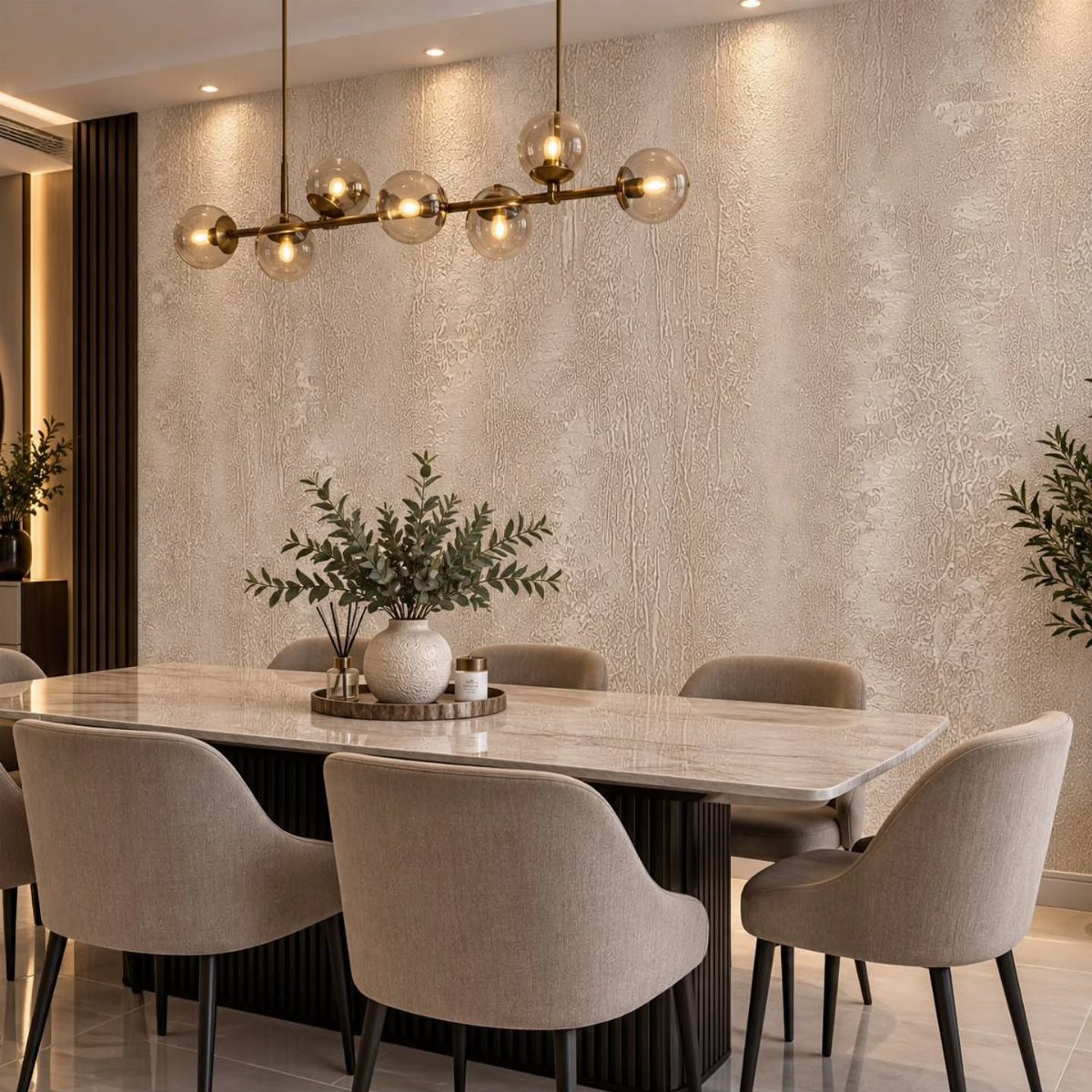
Grasscloth and linen wallpapers hide the small dents and uneven spots that flat paint shows off, which makes them forgiving on older walls.
The dense, almost vibrating patterns, tiny pebble clusters or miniature grids, read as texture from across the room rather than as a declared motif; they suit dining rooms that want formality without stiffness.
Peel-and-stick versions exist now, though the heavy woven ones usually need paste. I’d use this where the wall has taken some damage or where the room feels too bare to handle a strong color; it adds weight without shouting.
4. Gallery Wall
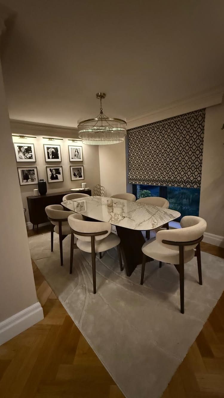
A gallery wall turns personal photographs and collected pieces into the room’s focal point, which costs less than one large painting and changes whenever you find something new.
The black-and-white portraits above the sideboard show one way to keep coherence: limit the palette even when the frame sizes vary, or keep the frames uniform and let the images differ.
Picture lights need wiring, but battery-operated versions now reach far enough to illuminate a row of frames. This works best when you already own pieces worth showing; starting from nothing gets expensive fast.
5. Brick Wall
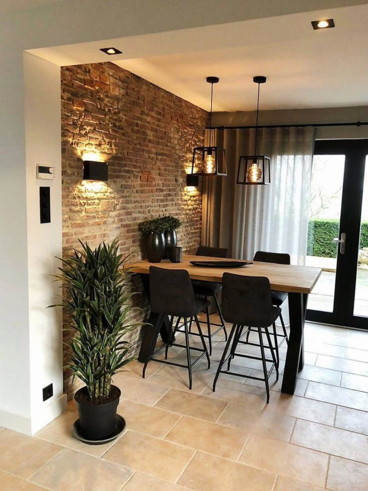
Exposed brick carries instant history, though the dust it sheds onto nearby surfaces is less romantic.
I’d choose real brick only if the house already has it and the structural work of exposing it is done; otherwise the faux route gets most of the look with none of the sealing and repointing.
6. Textured Plaster
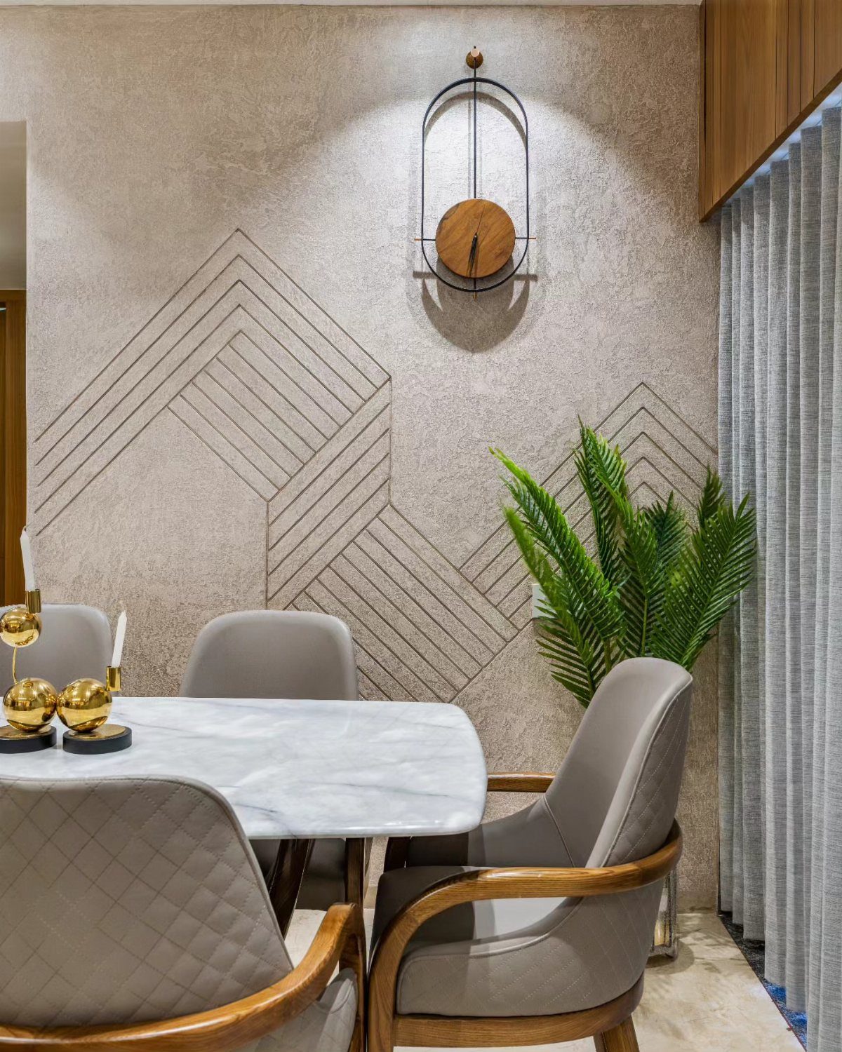
Carved lines in plaster catch shadows that shift through the evening, which makes this wall more alive than paint alone. Stippling or rag-rolling are the usual techniques, though geometric channels need more planning and a steady hand.
Accent lighting matters here; without it, the texture disappears after dark. This suits someone willing to spend a weekend on the wall itself rather than on hanging things over it.
I’d pair plaster texture with simple furniture, since both competing for attention wears the room out fast.
7. Geometric Panels
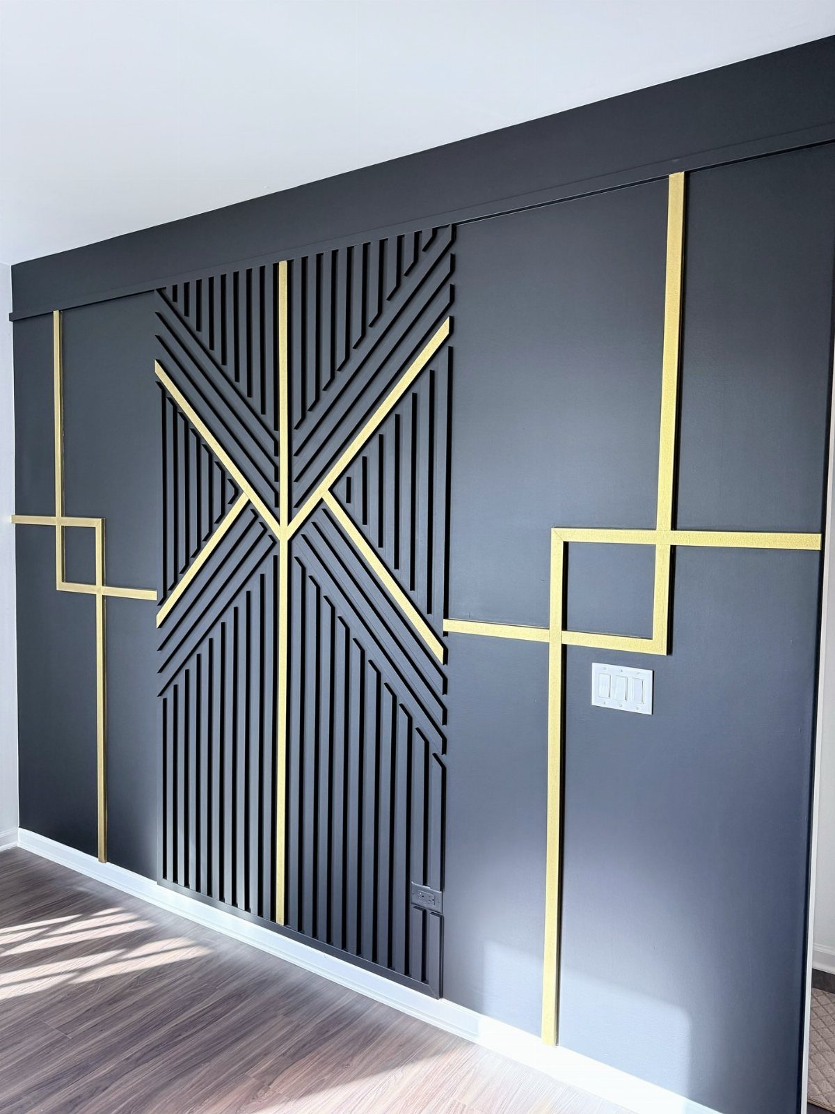
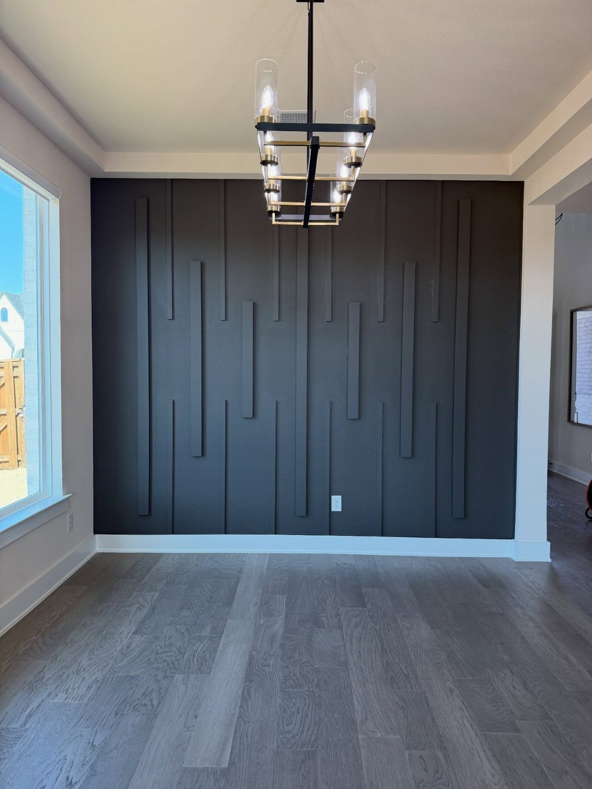
Thin wood or MDF strips laid in a repeating pattern give a wall the feel of built-in sculpture without the depth of actual relief. Vertical slats crossed by diagonal strips in a darker tone read as architectural rather than decorative.
This one suits renters who can patch nail holes later, since the strips mount flat and removal leaves minimal damage.
Precise measurements matter more than expensive material; a sheet of quarter-inch MDF and a miter box will get you farther than premium lumber cut freehand. Paint everything before assembly, or the gaps between pieces will show touch-ups for years.
I’d steer toward matte black or charcoal against warm white walls for a dining room that photographs well at night. High-gloss finishes catch every overhead reflection and compete with candlelight.
8. Wainscoting
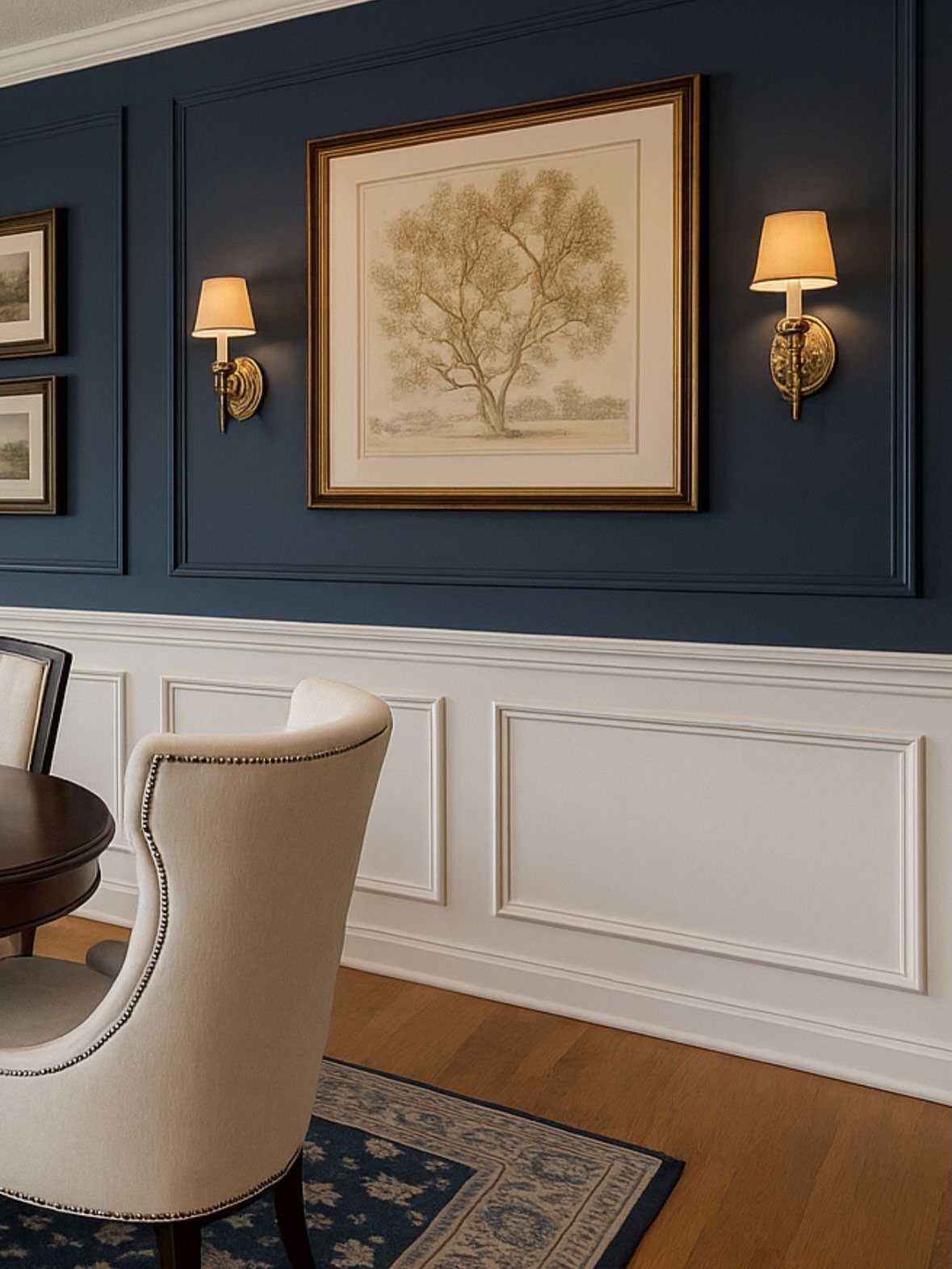
Chair-height paneling divides a wall into two zones that handle different jobs. The lower third takes the knocks from chair backs and passing elbows; the upper section carries color or art.
Crisp white wainscoting below deep navy turns a simple paint choice into something that reads as intentional architecture.
Raised panels in poplar or MDF run a few dollars per linear foot unfinished, and the math adds up fast in a standard dining room.
A simpler flat-panel version, routed from half-inch MDF sheets, costs half as much and paints to the same effect.
The real expense is time: cutting around outlets and coping inside corners will eat a full day even for someone who has done it before.
This look belongs in rooms where you want permanence. It signals settled-in, not temporary, which makes it a better fit for owners than for anyone measuring their stay in lease months.
9. Mirror Accent Wall
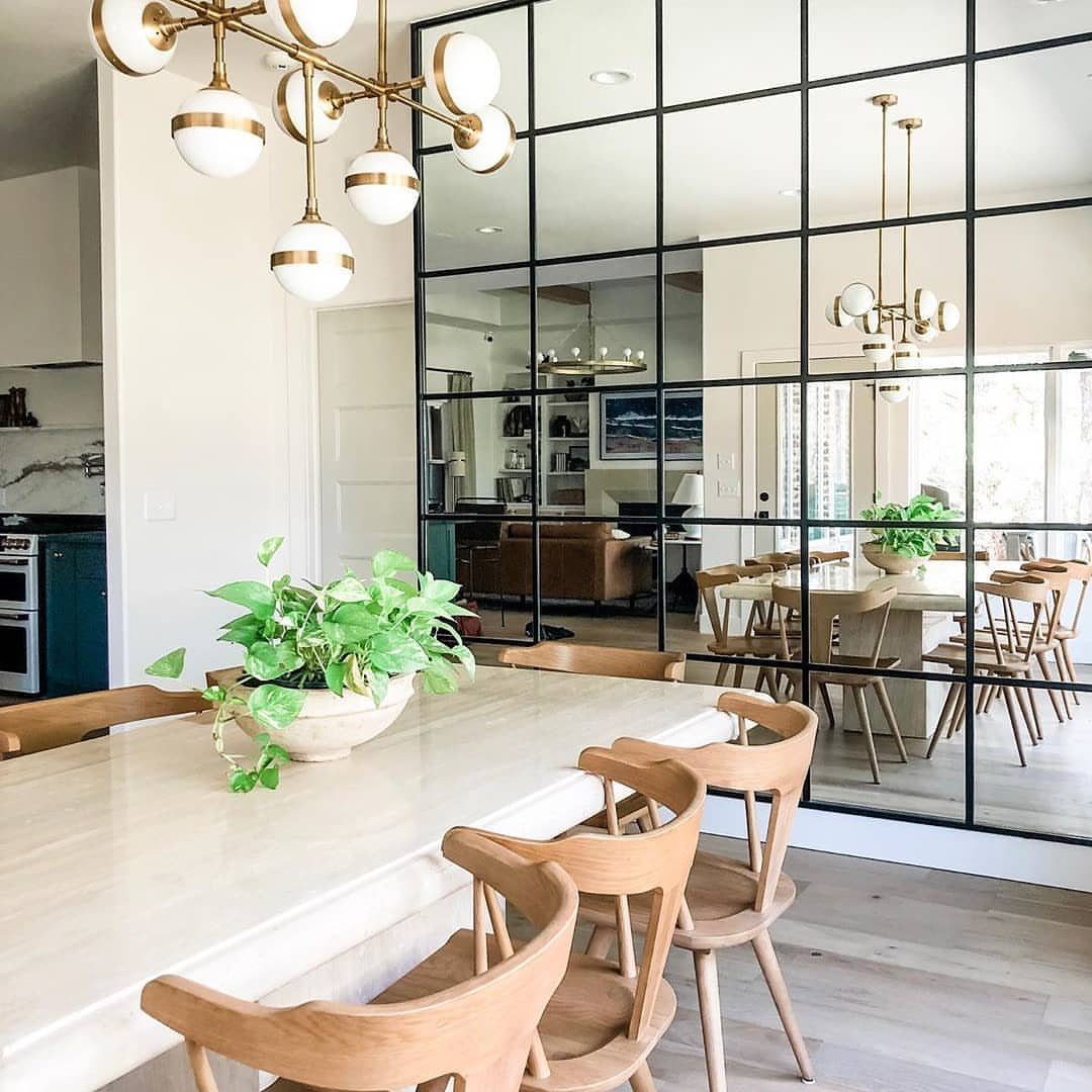
A grid of black-framed mirror panels does two things at once: it bounces whatever light the room gets, and it doubles the visual depth by reflecting the space back at itself.
The wall above the buffet is the natural spot, since mirrors facing a window pick up daylight and mirrors facing a chandelier multiply the fixture into something grander.
Installation needs more planning than a single heavy mirror. Each panel must sit level with its neighbors, or the grid lines read as mistakes rather than pattern.
French cleats work for the perimeter; the interior panels need adhesive rated for mirror backing, since standard construction adhesive can eat through the silvering over time.
This treatment favors rooms that already have something worth reflecting. A mirror wall facing a blank hallway or an exterior brick wall just shows the reader their own disappointment.
10. Tile Mosaics
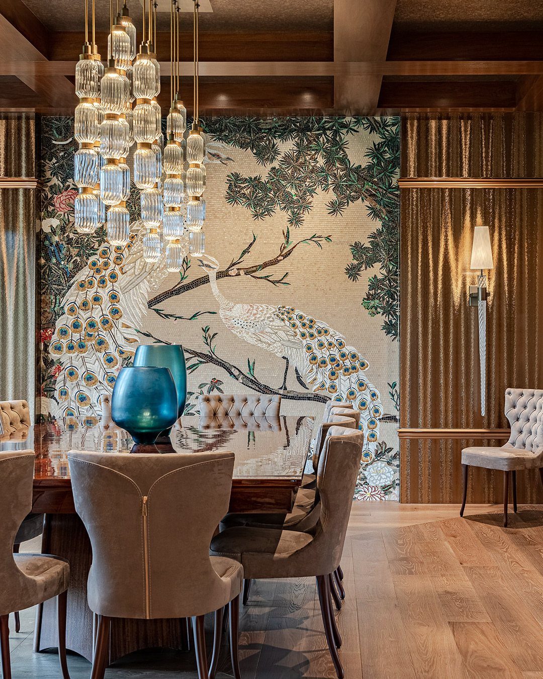
A mosaic wall reads as artwork you walk into rather than past, which makes it a natural fit for the wall facing the dining table, where guests settle in long enough to study the pattern.
The same technique works in quieter materials: small-format stone in a herringbone, or matte ceramic in a gradient from warm white to sand.
Mesh-mounted sheets speed installation enormously compared to individual tiles, though the sheets still need to be cut to fit around edges and outlets.
Grout color changes the whole effect; matching the tile color keeps the pattern fluid, while contrasting grout emphasizes the geometry of the layout.
Cost climbs fast here, and weight matters. Glass mosaic is heavy stuff, which means checking whether your wall can handle it before you fall in love with a design.
Stone mosaics run heavier still.
11. Striped Accent Wall
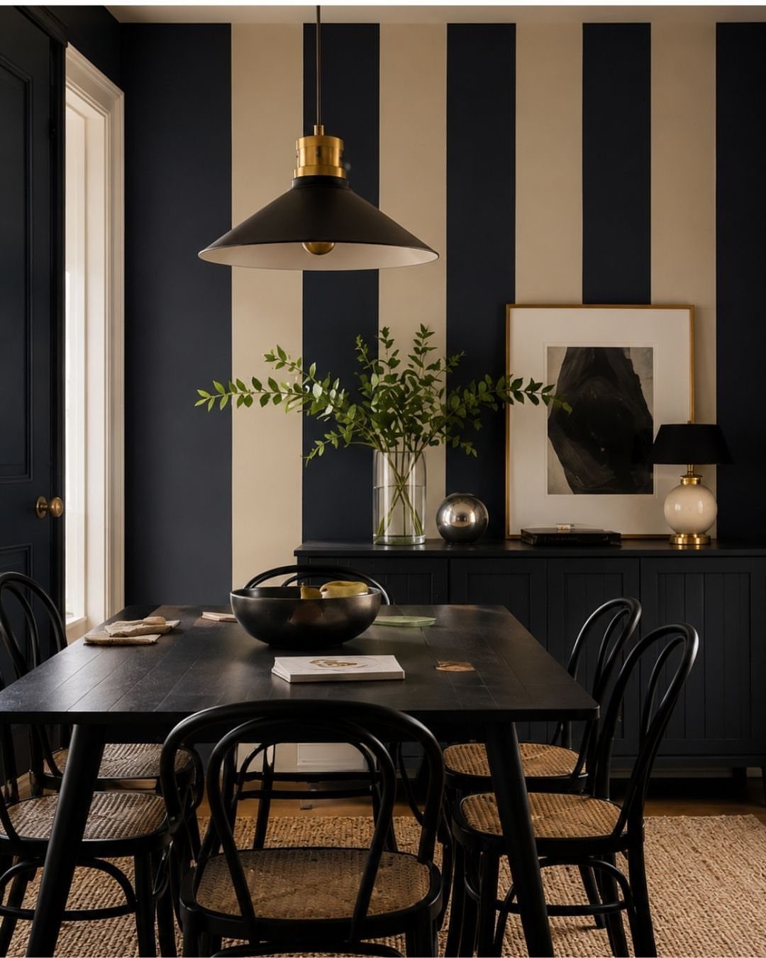
Vertical stripes draw the eye up, which helps a standard ceiling feel less like a lid on the room.
Wide navy and cream bands read as blocks of color from across the room, not as fussy pinstripes that demand close inspection to parse.
Painter’s tape is the whole tool kit for this one, and the result depends entirely on how carefully you apply it.
Press the tape edge with a putty knife after sticking it; any air gap lets paint bleed underneath and turns crisp lines into ragged ones.
Two coats of base color, then tape, then two coats of stripe color, with the tape pulled while the final coat is still slightly wet.
Horizontal stripes would have widened this narrow room; the vertical choice was the right one here. In a square room, either direction works, though vertical stripes carry more formality, which suits a dining room’s usual tone.
12. Deep Navy Blue Wall
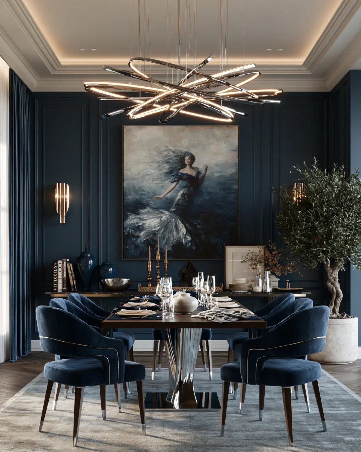
Benjamin Moore Hale Navy carries enough black in its base to feel grown-up under evening light, when cheaper navies turn cartoonish.
The LRV of 6.3 means it reflects almost nothing, so every imperfection in the wall surface telegraphs through; skim-coating and sanding before the first coat is not optional work.
Brass and warm wood are the natural companions to deep navy, and the contrast is what makes the room work. The navy throws the gold sconces and walnut table into relief, making them appear to glow by comparison.
Cool silvers or chromes would flatten against this particular shade.
Cutting in at the ceiling line demands a steady hand and a quality angled brush. Deep colors show every wobble, and tape alone will not save you; the contrast against white trim is unforgiving.
I’d block out a weekend for this, not a Saturday morning, and budget for an extra gallon; dark colors need full coverage, and thin spots read as dusty or uneven.
13. Accent Wall Behind Open Shelving
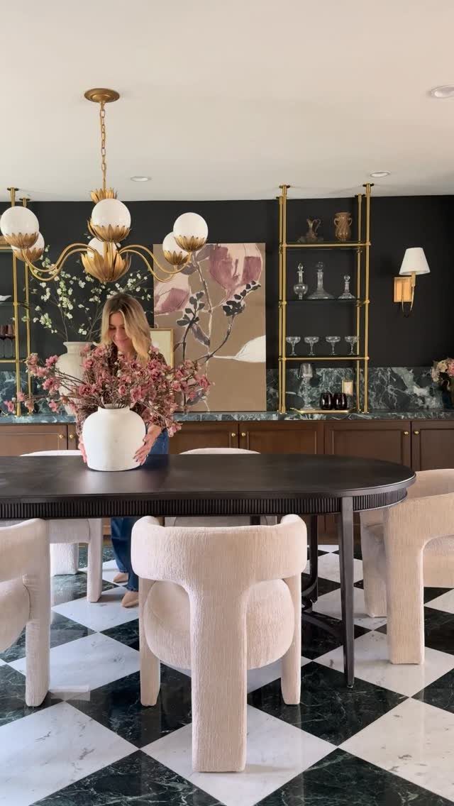
Open shelving turns the wall behind it into a stage. A deep green or navy behind open shelving turns white plates and glassware into something that reads more like a shop display than everyday dishes.
The full wall needs the color, not just the gaps between shelves. Patchy color reads like a repair job; solid color reads like intention.
Brass or black hardware against dark paint adds the warmth that keeps it from feeling like a void.
This works best when you actually use those shelves for things worth seeing. If your dishes are mismatched plastic, this isn’t the move for you.
But for renters, it’s reversible in a weekend and costs only a gallon of paint. I’d skip the upper cabinets entirely if I were starting fresh in a small dining room.
The vertical space feels bigger when your eye travels through it instead of stopping at cabinet faces.
14. Plate Collection Wall
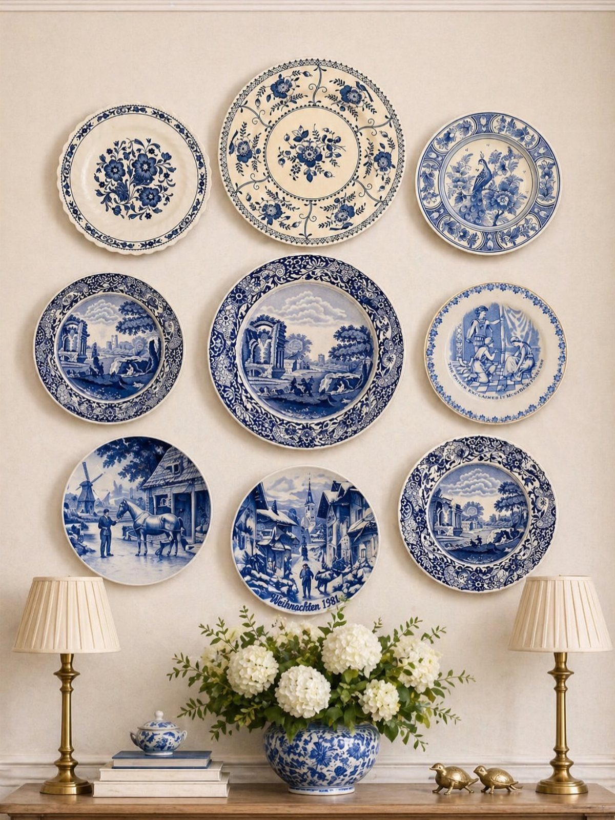
A plate wall is the accent that travels with you. Vintage blue-and-white pieces, family china, flea market finds hung in a loose grid, give a dining room personality no paint color can replicate.
The 3-5-7 rule from decorating practice helps here: three main colors, five textures, seven key pieces. Plates in two sizes, all sharing one palette, hit that rhythm without trying too hard.
Plate hangers run cheap for a set; no specialty hardware needed beyond a level and patience.
This suits the collector more than the minimalist. The downside is dust and the occasional re-hang after a door slam.
But unlike wallpaper, you can swap a plate out fast when the mood shifts. I’d pick this for a renter who wants impact without landlord negotiations, or anyone whose grandmother left better dishes than furniture.
Choosing the Right Wall
The wall behind the dining table is the natural choice because the eye lands there anyway.
A buffet or sideboard against that wall gives the accent something to anchor around, and the deeper color reads as intentional architecture rather than a random paint decision.
Doorways and windows chop a wall into pieces, and a statement needs something solid to land on. The interruptions fragment whatever you put there, so the effort spreads thin across too many small surfaces.
I would skip those walls even if they face the entry, where guests first look.
Ceiling height matters too. A tall wall behind a low sideboard can handle something vertical like wood slats or stripes; a short wall above a long buffet wants horizontal emphasis or a color field that pushes the boundaries outward.
Lighting Considerations
Without that side lighting, the texture flattens to shadow and the weekend spent on application goes invisible.
Pendant lights over the table draw a straight line to whatever wall sits behind them, so that wall needs to be the one you planned on featuring.
A chandelier centered in the room throws its glow in a circle; the wall that receives that reflected light should be worth the attention.
Wall-mounted fixtures above a mirror grid multiply both the fixture and its glow, though the reflection also multiplies every speck of dust.
Maintenance Tips
Grasscloth wallpaper near a dining table collects grease particles over time, and cleaning it requires a dry cloth or specialized cleaner; water stains the weave.
I’d place it on a wall that does not sit adjacent to cooking smells or heavy traffic.
Exposed brick sheds dust onto sideboards and ledges, which means quarterly wiping of whatever sits near it. The sealing that real brick needs is not a one-time job; it dulls and requires reapplication every few years where humidity swings.
Mirror panels show every fingerprint, so a dining room that hosts weekly dinners needs glass cleaner kept handy. The grid format multiplies the edges where smudges collect.
Painted wood slats trap dust in their gaps; vacuuming with a brush attachment monthly keeps the contrast crisp. Dark colors like Hale Navy telegraph scuffs and lean marks, so the touch-up kit should stay in the closet, not the garage.
Mixing Materials
A wall can carry two textures if they share a color family. Navy grasscloth below a chair rail and Hale Navy paint above it reads as one decision with variation, not as competing ideas.
Keep the tones near enough to each other that the eye glides across without catching on the switch.
Brick and wood warm each other when both stay in the same range of aged reds and browns. I’d avoid pairing slick finished wood against rough brick; the contrast in surface treatment fights harder than the contrast in color harmonizes.
Plaster texture behind open shelving works when the shelves themselves are simple painted MDF. Let the wall do the visual work and keep the shelving flat.
Two sculptural elements in the same view exhaust the room.
Glass mosaic and mirror both reflect light, so I would not place them on facing walls. The bounce becomes glare, and the room feels like a hotel lobby rather than a place to eat.
One reflective surface per sightline is enough.
Frequently Asked Questions
Are accent walls out of style in 2026?
No. Accent walls that go beyond a simple paint shift, like wood slats or panels that catch light differently through the day, still add depth flat walls cannot manage on their own.
The layered effect reads as current because it treats the wall as architecture rather than just color.
What are the dining room trends for 2026?
Deep navy walls with brass fixtures, textured plaster that catches evening shadows, and geometric wood strips in matte black against warm white are all showing up in rooms that photograph well after dark.
Renters who want impact without permanent change are gravitating toward peel-and-stick murals and heavy woven wallpapers in 2026.
What is the rule for accent walls?
Pick the wall that naturally holds attention, usually the one behind the dining table or the one with a buffet or sideboard against it.
A wall chopped up by doorways and windows costs too much cutting around trim for the small visible surface you end up with.
In a dining room that flows into the kitchen, the accent should relate to what sits across the open space so the rooms read as connected.
Can I use wallpaper for an accent wall in my dining room?
Yes, and the heavy woven kinds like grasscloth or linen hide small dents and uneven spots that flat paint would advertise. Limit the pattern to one wall and keep the others neutral so the room does not compete with itself.
What colors work best for an accent wall?
Deep colors with enough black in the base, like Benjamin Moore Hale Navy at LRV 6.3, stay grown-up under evening light when cheaper navies turn cartoonish.
Terracotta or deep green read as cozy; lighter greiges work only when the contrast against neighboring walls is strong enough to register as intentional.
Dark colors can feel like a cave by late afternoon in a small, north-facing room, so test first.