Thirteen ideas, most doable in a weekend, most landing between a few hundred and a couple thousand dollars.
The one that belongs on your wall depends on whether your room needs to feel taller, warmer, quieter, or simply finished by Sunday night.
A matte black wall pushes the sofa forward into the room; a raised hearth with stone veneer turns an electric fireplace into actual architecture.
1. Dark Statement Wall
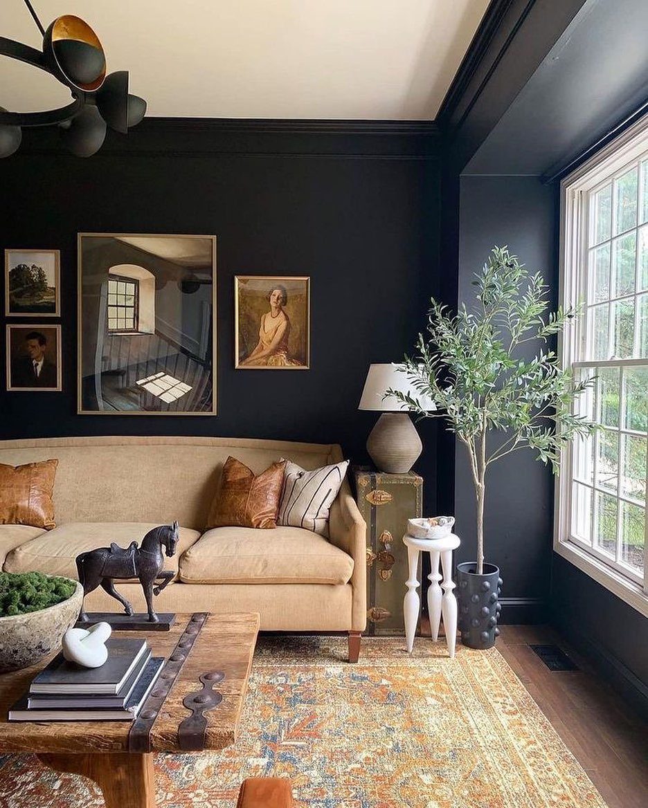
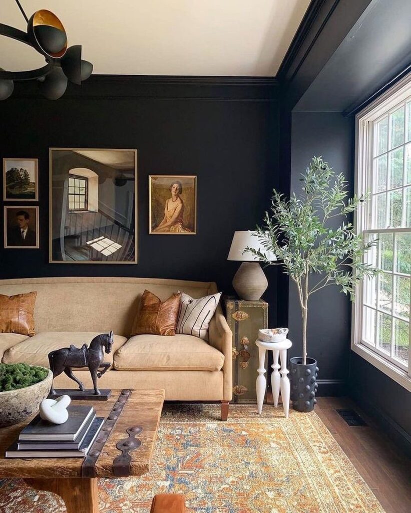
Black paint on the wall opposite your largest window does something no lighter color can: it swallows the background whole and pushes your sofa forward into the room.
A matte or eggshell finish reads richer than flat paint and hides the unevenness that shows up under gloss on a dark color. Satin bounces light around without going glossy, and it keeps the surface from going flat dead.
I would not try this in a room with one small window and no overhead fixture; the darkness wins too easily there.
Deep teal works the same way if black feels too final, and it carries a little more warmth behind a fireplace or a long seating wall.

Ready to use, pre-mixed door and trim paint offers a fresh new look on interior or exterior metal, wood and fiberglass

WHERE TO USE THIS COLOR - BLACK (MATTE FINISH) – An all around traditional black that is great for walls, furniture or any black colored applications

Made in United States
2. Half-height Accent with Wallpaper
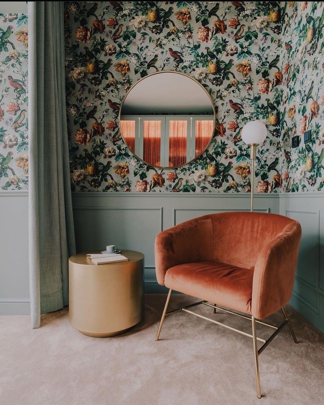
Wallpaper above a painted wainscot line splits the visual load so neither pattern nor color has to carry the whole wall.
The lower third takes the scuffs and chair bumps, which is why washable paint matters more there than anywhere else in the room.
For renters, the wallpaper peels off when the lease ends and the paint stays; the landlady never knows.
A mural instead of repeating pattern turns the whole upper section into one piece of art, though that choice wants a room that can handle a single bold story without fighting the sofa.
3. Wood Slats Statement Wall
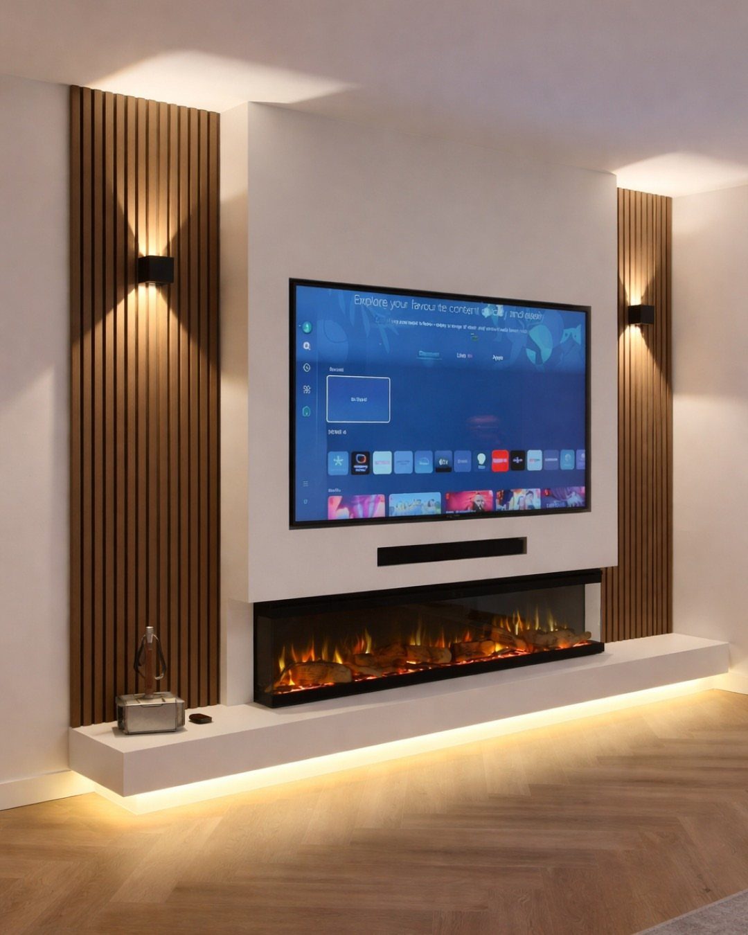
Vertical slats flanking a recessed TV and fireplace give a media wall the rhythm of a built-in without the built-in price.
The grain runs up, which draws the eye toward the ceiling and makes the wall feel taller than the same material laid flat.
Limewash or plaster could sit in the recessed center panel instead of flat paint, adding hand-worked texture where the slats provide structure. This approach asks for patience with spacing; uneven slats read as mistake, not style.
I would measure twice and rent the nail gun.

Authentic Distressed Look Design : The realistic appearance and gray-white tone of white wooden wallpaper,showcases a wood texture with natural imperfections,that captures the timeless beauty weathered wooden planks

Unique Design Wallpaper: Elegant peel-and-stick wallpaper featuring a classic beige design with floral patterns, adorned with branches and botanical elements. It perfectly blends vintage charm with modern rustic flair, making it an ideal choice for furniture, shelves, and accent walls, adding a touch of pastoral charm and natural elegance to any space
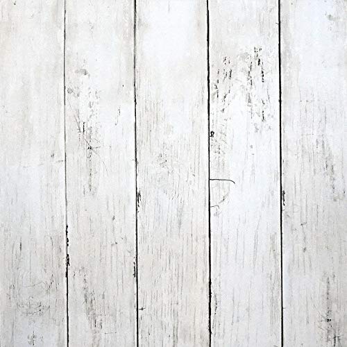
Authentic Distressed Look Design:The realistic appearance and gray-white tone of white wooden wallpaper,showcases a wood texture with natural imperfections,that captures the timeless beauty weathered wooden planks
4. Fireplace Accent Wall
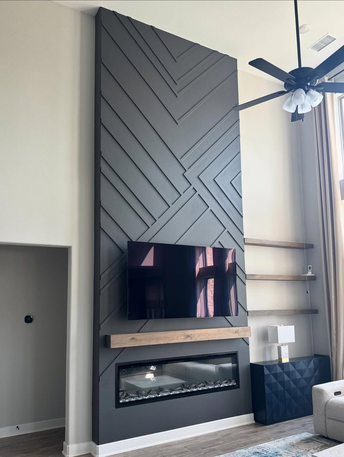
An electric fireplace mounts like a television, hardware included, which means the hard part is everything around it.
A raised hearth built out from the wall gives the unit a place to sit and gives you a ledge for coffee cups or winter boots.
Stone veneer on that hearth, or geometric trim on the surround, takes the wall from appliance display to actual architecture. The heat is real enough to feel, but there is no chimney to line and no gas to run.
This is the first project I would hand to someone who wants something warm finished by Sunday night.

Adds Warmth, Texture & Character** – Instantly elevate your space with sleek slatted panels that bring depth and style to living rooms, bedrooms, offices, and feature walls

Cover More Walls with Fewer Panels: This 6-pack wood panels for wall set covers approximately 46.5 sq ft with six oversized panels, making it easier to complete feature walls, media walls and larger interior projects with fewer seams and a cleaner finished appearance

Modern and Elegant Design - The wood slat wall panels have been carefully designed to effortlessly transform any space, enhancing the surroundings both visually and acoustically. The wood panels help to create an environment that is not only quiet but beautifully contemporary, soothing and relaxing. Furthermore, our slat wall panels can be installed horizontally or vertically and cut to any shape allowing for creativity and a unique look to fit your aesthetics.
5. Natural Texture Finishes
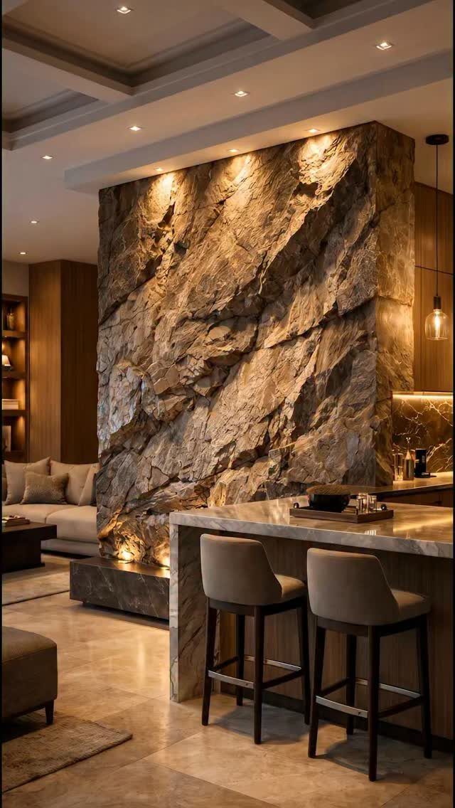
Plaster or limewash on a single wall adds depth that flat paint cannot touch, and it does not eat floor space the way a bookcase or a built-in would.
In a smaller room, that texture reads as luxury because it signals effort and material without clutter.
Real plaster demands skill and a longer budget; a faux plaster kit from the hardware store gets close for less, though the finish will not fool anyone who touches it.
Stone veneer works the same way for a rougher, more grounded feel, and the recessed spots where light pools become part of the texture itself.

What You Get:10 sheets thicker self-adhesive wall tiles,12" x 12" each tile, total covers around 10 square feet area.

SPECIFICATION: A single package contains 12 3d decorative wall panels, 19.7"x19.7"x0.12" each, covers about 32.4 square feet. NOTICE: Tape not included, cover as large area as possible on the back to increase adhesion

Unique Geometric Linear Design:Modern mixed-pattern layout combining vertical slats, herringbone, and linear textures with natural marble finish—adds depth and a premium decorative look to any space.
6. Marble-look Accent Wall
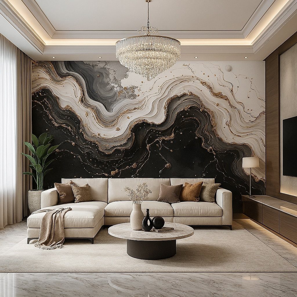
A marble-look wall behind a quiet sofa stops the room from feeling like a showroom by giving the eye one place to rest and everything else permission to stay simple.
The pattern carries enough interest on its own, so plain pillows and simple art keep it from feeling crowded.
Black and gold veining on a light ground reads formal, but the same technique in softer gray and white could suit a more casual space.
This is the choice for someone who wants one expensive gesture without the actual expense of slab stone. Let the wall breathe; too much else going on and it reads as wallpaper, not a statement.

ALL-IN-1 PAINT & PRIMER: A hardy multi-purpose and multi-surface one-coat paint and primer in one for almost any indoor or outdoor surface. A wall, ceiling, floor, skirting board, cabinet, furniture and door paint for your bathroom, kitchen, home and garden.
ALL-IN-1 PAINT & PRIMER: A hardy multi-purpose and multi-surface one-coat paint and primer in one for almost any indoor or outdoor surface. A wall, ceiling, floor, skirting board, cabinet, furniture and door paint for your bathroom, kitchen, home and garden.

WHERE TO USE THIS COLOR - BLACK (MATTE FINISH) – a versatile black great for furniture or anywhere you need to touch up black colored objects
7. Exposed Red Brick Wall
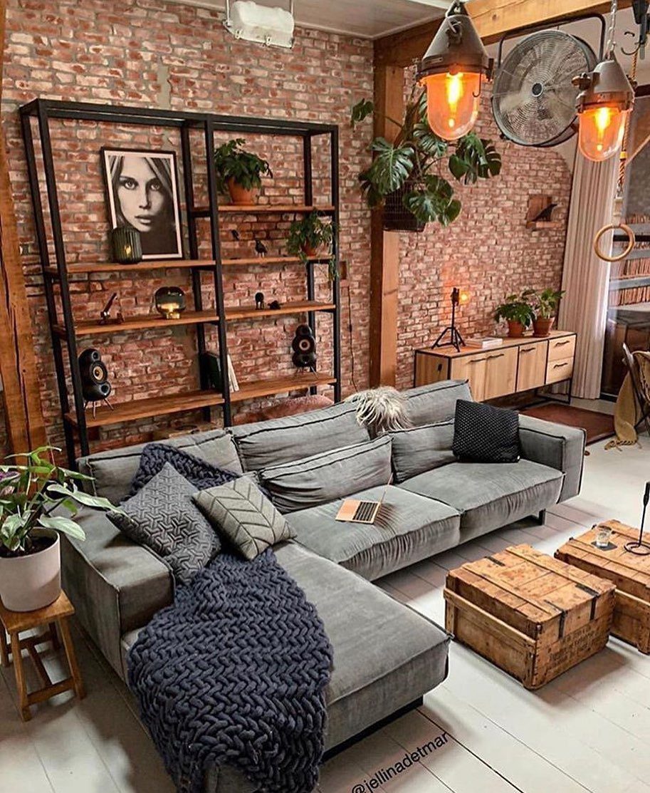
Exposed red brick carries the slight unevenness of a wall that was never meant to show, which is exactly why it reads as character rather than theater.
The industrial look pairs naturally with metal shelving and neutral upholstery, so the investment stays in the furniture you already planned to buy.
Real brick is heavy and needs structural check; thin brick veneer or faux panels give the same warmth for a fraction of the weight and a weekend’s work.
Paint it if the red fights your palette, though that trades away the lived-in quality that makes the choice matter.
Best for lofts, older homes with existing brick hiding under drywall, or anyone who wants warmth without rustic cliché. Skip it if your room runs small and dark; the texture swallows light.
8. Illuminated Organic Recessed Wall
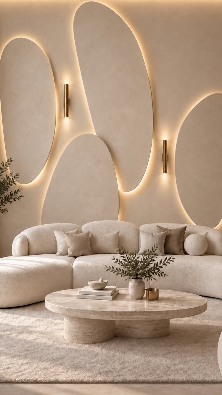
Soft, rounded recesses in a wall surface catch light differently than anything flat, and the integrated LED strips take the place of both art and sconces.
The panels above the sofa read as sculpture but function as the room’s only accent, which keeps the rest of the space calm.
This is millwork territory, not a weekend project; the curves need CNC routing or a very patient carpenter with a template. The warm tone of the backlighting matters more than the panel color, since the glow does the visual work.
Dimmable drivers let you shift from reading light to evening ambience.
Suited to new builds or major renovations where the wall is already open. Retrofitting means losing floor depth and accepting seams.
A curved sofa repeats the wall’s lines so the whole room reads as one thought instead of two competing ideas.

Unique Design: Transform your space with this sophisticated peel and stick wallpaper featuring a luxurious black background adorned with intricate gold floral and leaf patterns. It adds an instant touch of glamour and artistry to any room, without the commitment of traditional wallpaper
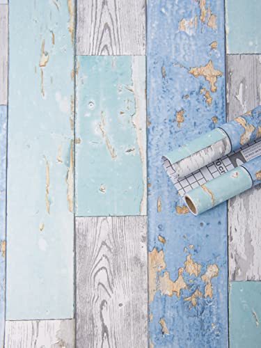
PREMIUM QUALITY CONTACT PAPER: Our Wood Contact Wallpaper is waterproof and oil proof, Can be applied to the object with the smooth surface ,kitchen counter, furniture, notebook, dresser drawer, crafts, bedside table, bookcase, door even wall.

Unique Design Wallpaper: This elegant peel-and-stick wallpaper artfully blends a light green background with botanical motifs, using bright, soft tones to convey a vibrant, relaxed, and cheerful atmosphere. It creates a lighthearted dialogue between vintage rustic charm and modern living, fostering a warm, nostalgic sense of home
9. Molding Framed Textured Wallpaper
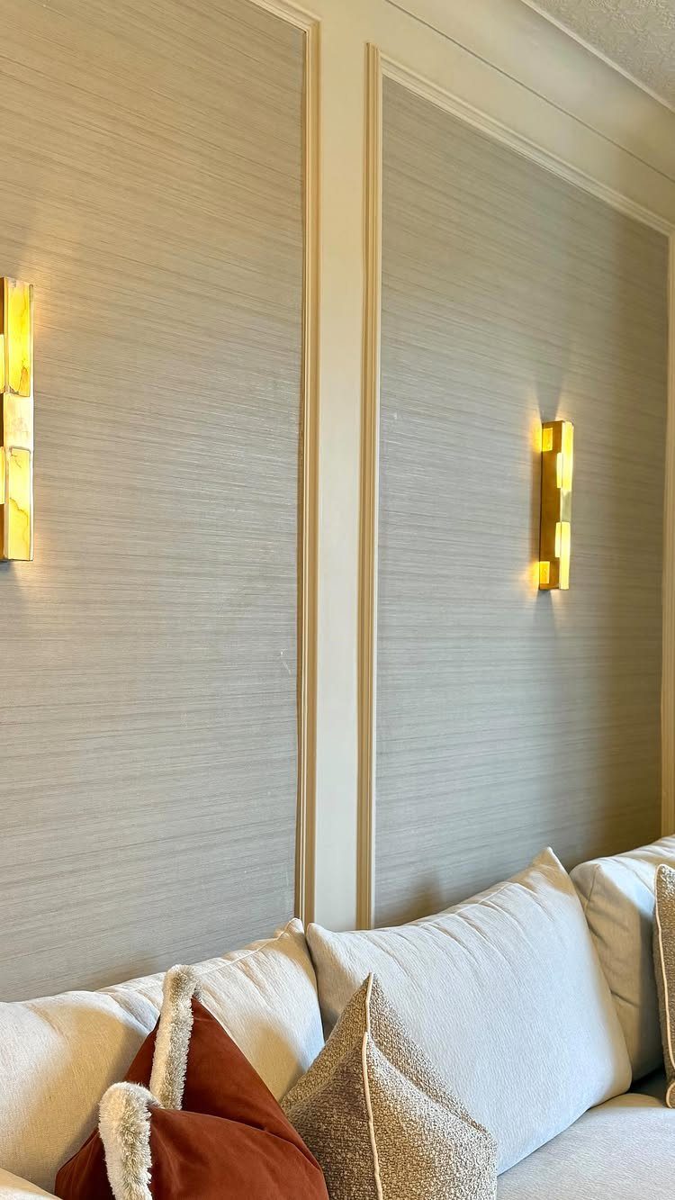
Picture molding breaks a wall into panels the way wainscoting does, but hung at eye level it frames texture instead of protecting plaster.
The wallpaper beneath reads as fabric or plaster depending on the light, and the sconces turn each frame into its own vignette after dark.
Installation runs in two stages: molding first, wallpaper second, with careful measurement so seams fall behind rails rather than crossing panels. Pre-primed molding saves a sanding step; textured paper hides more wall imperfection than flat.
Brass sconces with warm bulbs keep the grey from reading cold, though matte black works in rooms with more natural light.
The formality suits anyone who wants traditional structure without fussy florals. Renters can fake it with peel-and-stick wallpaper inside pre-made picture frames, leaned rather than mounted if the lease forbids.

【Superior Sound Dampening】- Art3d wood wall panels are engineered to significantly minimize noise levels in any setting. Crafted from high-density polyester fiber, these panels absorb sound waves, enhancing acoustics and fostering a more serene and comfortable environment

EXCEPTIONAL ACOUSTIC PERFORMANCE - Our wall wood panels, with a high 1750gsm felt density, significantly outperform standard 1350gsm options in sound absorption and noise reduction, creating a peaceful and acoustically optimized environment.

Stylish Design & Simple Installation: Elevate your space with these modern wall panels, featuring clean lines and beautiful wood grain finishes. Installation is quick and easy on any wall or ceiling using just glue or screws, making your accent wall project effortlessly stylish.
Choosing the Right Wall
The wall behind your sofa or television already commands attention the moment someone enters the room. Working with that natural focal point means the statement reads as intentional rather than forced.
A side wall with no furniture against it and no architectural feature rarely rewards the effort. The eye passes over it on the way to something else, and a bold treatment there can feel like decoration trying too hard.
Designers now favor walls that already carry visual weight rather than manufacturing importance where none exists. Behind the fireplace, at the end of a long sightline, or opposite the entry door are the usual candidates.
The result should feel like the room was always meant to look this way.

Premium HD Sticker Decals: Vibrant high-definition printing with a mirror-gloss finish. Made of upgraded PE material-waterproof, oil-proof, and fade-resistant for kitchens, bathrooms, and high-moisture areas


0.12" UPGRADED THICKER & STURDY: Unlike thin 1mm vinyl stickers, our tiles are 3mm (0.12") thick for a premium 3D feel. Made of PVC, they are 100% waterproof and oil-proof for kitchen stove areas and bathroom vanity backsplashes. (Note: Not for use in shower stalls or areas with direct water contact)
Color Selection Tips
A sample that looked rich under the store lights turned muddy on my living room wall by late afternoon. That is why I paint large swatches, 2 feet square at minimum, and live with them for a couple of days.
Morning sun, overhead fixtures, and the blue hour after sunset each pull a different story from the same pigment. A satin finish I loved at 10 a.m. went flat and cold by evening until I swapped the bulb temperature.
The paint did not change; the light did.
Testing on the actual wall matters more than testing on poster board. Your plaster or drywall absorbs color differently, and the adjacent walls reflect their own tones into the wet edge.
Watch the sample during your actual routines, not just in passing.
Common Mistakes to Avoid
Three common errors undo even good material choices.
Choosing a wall at random breaks the room’s flow. The accent should answer to something, a fireplace or a seating anchor, not float unmoored between windows.
Using too many competing colors or textures turns the statement into noise. One wall carries the gesture; the others provide quiet room to breathe.
Ignoring the light you actually have leaves a finish flat or overwhelming. A dark color under weak fixtures sinks the space, and a bold pattern in glare becomes impossible to rest against.
Test under your bulbs, not the ones in the store display.
Budget Considerations
Paint and peel-and-stick wallpaper run $50–$200 and ask only for time and a steady hand. That is where I would start if the checking account is thin after rent.
Wood slats, textured paint treatments, or conventional wallpaper push the range to $200–$800. The jump pays for material depth and the tools to install it, not just surface coverage.
Above $800 sits marble, custom panels, stone veneer, built-in millwork, and backlit recesses. These need skilled labor or specialized equipment.
The trap is imitating a luxury finish with poor materials. A simple painted wall with good lighting and balanced furniture reads cleaner than a complicated treatment that ran out of money halfway through.
Pick one idea you can execute fully, then stop.
Frequently Asked Questions
Are accent walls out of style in 2026?
No. The direction for 2026 runs toward warmth, texture, and personality rather than cold minimalism. Earthy browns, smoky greens, and warm neutrals are replacing the flat grays and icy whites of past years.
Ceilings are getting the statement treatment too, so feature walls are shifting toward more architectural, immersive ideas rather than fading out.
What are some creative ideas for statement walls?
Paint, wallpaper, molding, paneling, built-ins, any of these can land if you plan the composition and commit to it.
Geometric designs with painter’s tape, peel-and-stick wallpaper, DIY wood slats, simple molding grids, painted arches behind the sofa, two-tone splits, and mini gallery walls with one strong theme deliver presence without a full remodel.
Pick one method and let it do the work instead of stacking several together.
What is the new trend for living rooms?
Layered, textural spaces with warmth and personality are replacing loud standalone features. Natural materials, hand-worked finishes like plaster and limewash, and earthy, refined color palettes are showing up more often.
Statement surfaces are becoming more architectural and immersive, with texture mattering more than pattern alone.
What are the rules for wall decor in a living room?
Choose a wall that naturally draws attention and let the furniture face it or relate to it visually.
Give the treatment some open space around it; one oversized piece, a structured shelf, or a tight edit of accessories beats a scatter of small stuff. A bold wall calls for quieter styling.
What color can make a small living room feel larger?
Lighter neutrals and cool hues reflect more light and create a perception of spaciousness. Vertical lines in a tight room can trick the eye into reading more height.
Heavy dark stone, oversized prints, and too many competing colors will compress the space instead of expanding it.
Is implementing an accent wall advisable for a small living room?
Yes, when the choice is light, slim, and restrained. In a small space, texture tends to hold up better than busy pattern, and the wall should add structure, not clutter.
Skip heavy dark materials and crowded décor that fight each other for attention.