
These ideas run from a single gallon of matte paint to a weekend of trim carpentry with a miter saw, and the right one depends on whether you need to undo it when the lease ends or live with it for years.
Hand-painted murals and painted arches erase with one coat of base color; board and batten or wood panels stay with the wall.
1. Bold Bedroom Accent Wall
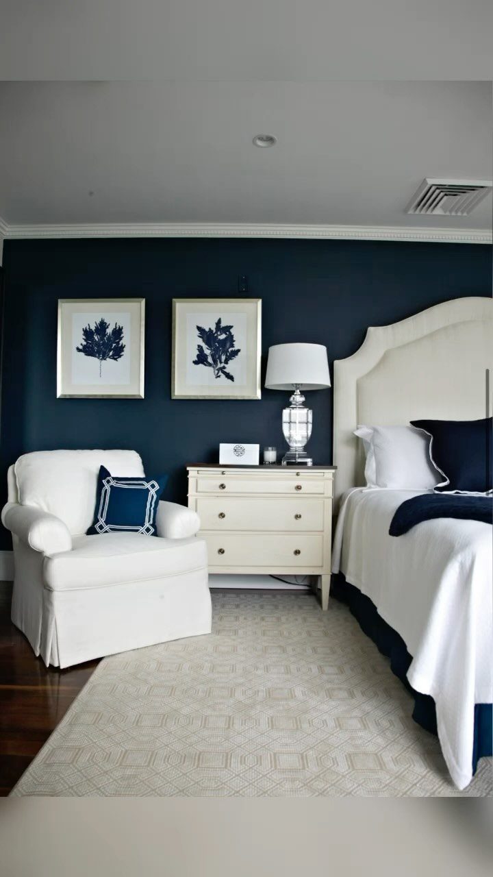
Navy behind a white headboard reads as intentional rather than safe. The color drops low enough to feel grounded without swallowing the room.
Soft bedroom pairings work best when one tone carries the weight and the other steps back.
I would pair something like Benjamin Moore’s Hint of Violet or Quiet Moments with white linens for a similar balance, though the exact shade matters less than keeping the saturation consistent across the wall.
This suits renters who can paint one wall and landlords who notice the edges less than they notice a whole dark room. White furniture against a bold wall does half the decorating work for you.
2. Wood Panels
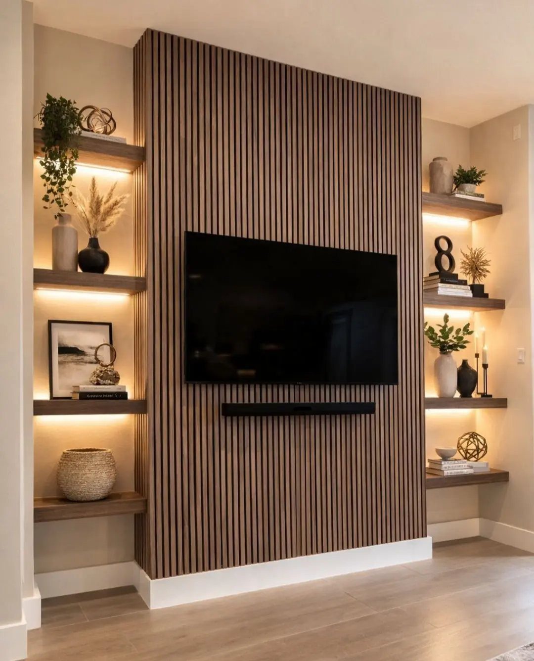
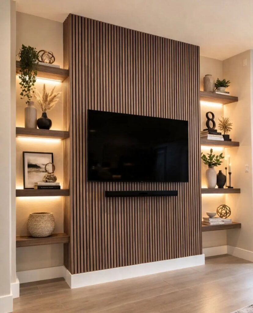
Vertical slats behind a TV solve two problems at once: the screen disappears when it’s off, and the wall gains texture without demanding art.
Thin panels read modern when the gaps stay tight and uniform; wider spacing or rougher wood tips toward rustic. The choice depends on whether your room already has organic elements or clean lines.
I would check the slat thickness against your wall studs before ordering, since mounting into drywall alone sags over time.
Recessed lighting in the flanking shelves is optional but worth wiring if you are already opening the wall. Without it, the slats can feel heavy in a dim room.
3. Wallpaper Accent Wall
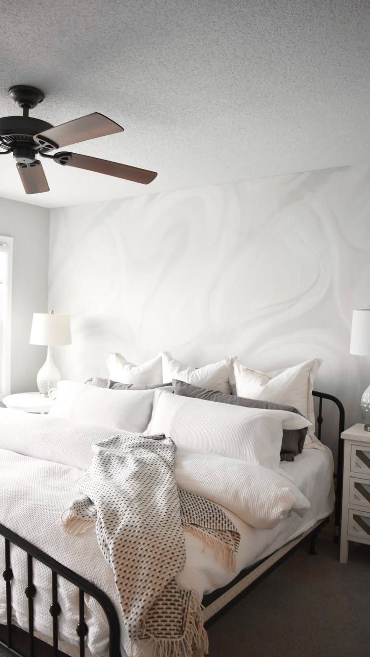
One wall of pattern lets you go bolder than you would across a whole room. A swirling print that reads almost neutral from a distance keeps a bedroom livable.
Mural-style wallpaper gives the immersive effect without the months of commissioning or the pressure of painting freehand.
Order a sample large enough to see the repeat at actual scale; what reads as subtle on a small swatch can dominate once it covers the wall.
Jewel-toned upholstery elsewhere in the room, as one approach goes, balances the visual weight so the wall does not feel like it is falling forward. Start with the paper, then pull two colors from it for pillows or a throw.
4. Black Accent Wall
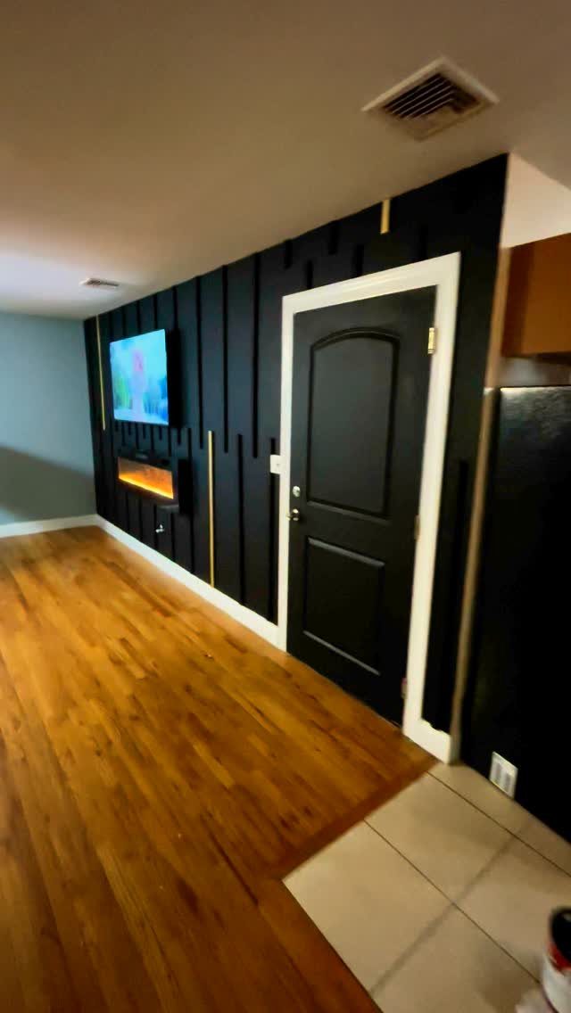
A black wall with vertical slats and brass inlays is not a neutral background. It is the statement, and everything else arranges around it.
Brass lines keep a black wall from reading as a void. Without metallic or wood warmth, the effect flattens to matte gloom.
Sherwin-Williams Tricorn Black in a saturated finish carries depth better than flat paint, which chalks under overhead light.
This works in rooms with good natural light and pale floors that bounce some of it back.
In a north-facing space or one with beige carpet, I would paint the wall behind the TV only and keep the surrounding walls light. The room feels smaller, but the cohesion can be worth it.
5. Geometric Patterns
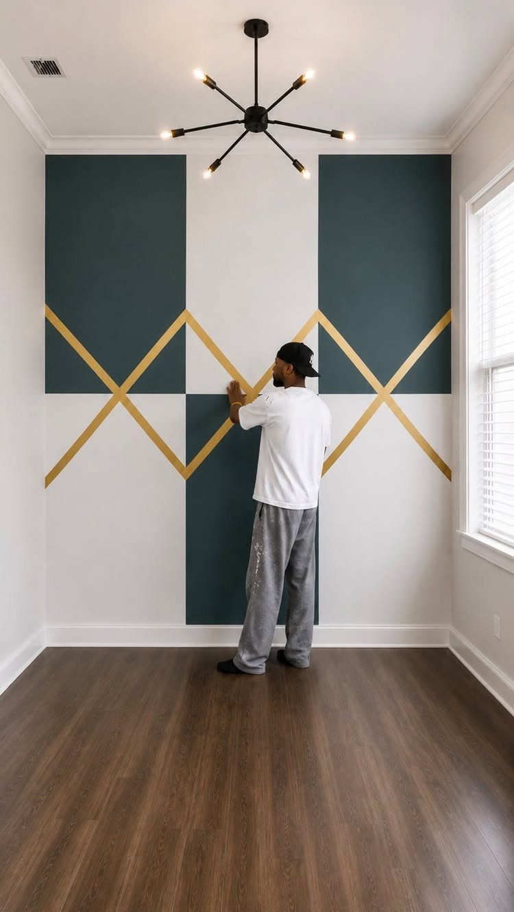
Three colors of diagonal lines turn a flat wall into folded paper. Dark teal, white and gold sit far enough apart on the value scale that the pattern reads from the doorway.
Stencils keep the angles consistent; freehand gives movement at the cost of some wobble. I would tape the base color first, let it cure overnight, then lay the pattern on top.
Rushing between coats pulls the tape and smears the edge.
Chevrons or hexagons demand more planning than stripes but forgive small errors better, since the eye expects complexity. This suits someone who has a full weekend and a level, not someone who wants it done Saturday morning.
6. Accent Ceilings
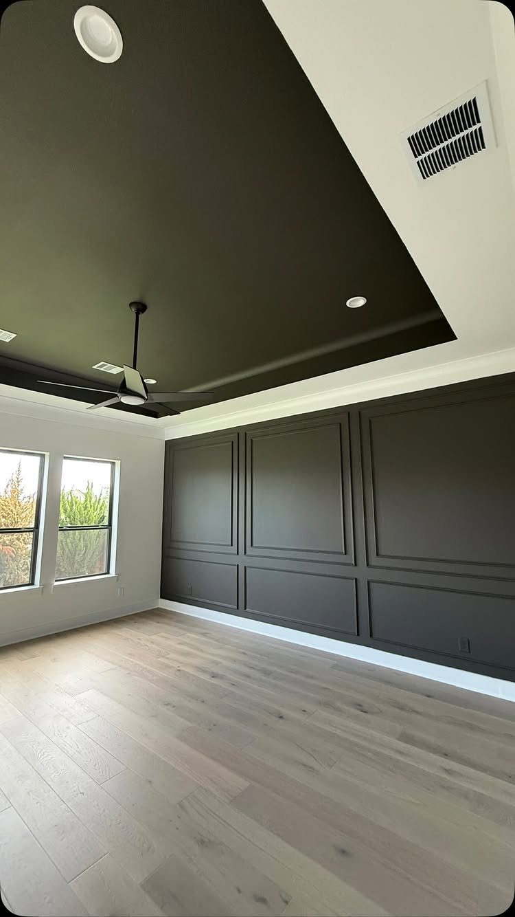
Ceiling and wall in the same dark charcoal push the room’s boundaries outward. The eye loses the corner where they meet, which makes the space feel larger, not smaller, though the color itself is heavy.
Picture-frame molding on the wall and a recessed ceiling detail give dark paint architecture to follow. Without molding or a tray ceiling, flat color overhead can read as a mistake.
I would paint the ceiling and any crown molding first, let them dry fully, then mask carefully for the wall. Angled brushwork where wall meets ceiling is harder upside down.
A black ceiling fan disappears against the dark surface, which is either sleek or a waste of the fixture you chose; I would pick something with light wood blades or brass accents if I wanted it seen.
7. Hand-Painted Murals
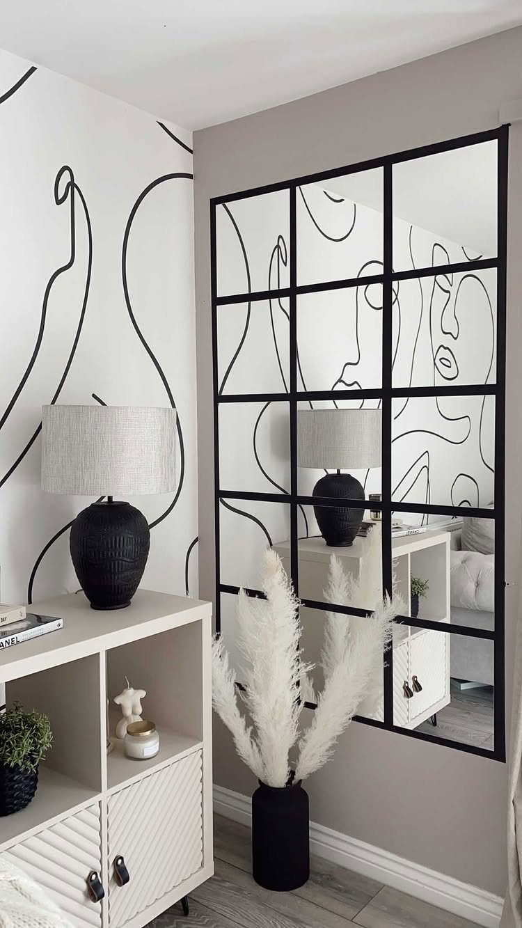
A hand-painted mural turns a wall into something no one else owns. A hand-painted mural can be one continuous line that reads as faces or abstract shapes, done in a corner where two walls meet.
Decent brushes add another expense if you do not already own them; buy the best you can afford and clean them well afterward.
The technique that matters is leaving imperfection visible. One maker erased earlier chalk art and kept the smeared ground as texture beneath new paint.
You can do the same with any base: a faint grid, a washed color, even a failed first try. Draw freehand in pencil, then commit with black interior paint in satin or eggshell.
Flat hides errors too well and looks like vinyl; gloss shows every waver.
This suits renters who can paint over later, or owners who want art without the frame-shop bill. It trades the polish of prints for personality, and it takes a Saturday, not a skill degree.
If your line work wobbles, make the wobble the style: continuous-line portraits thrive on exactly that.
8. Exposed Brick Accent Wall
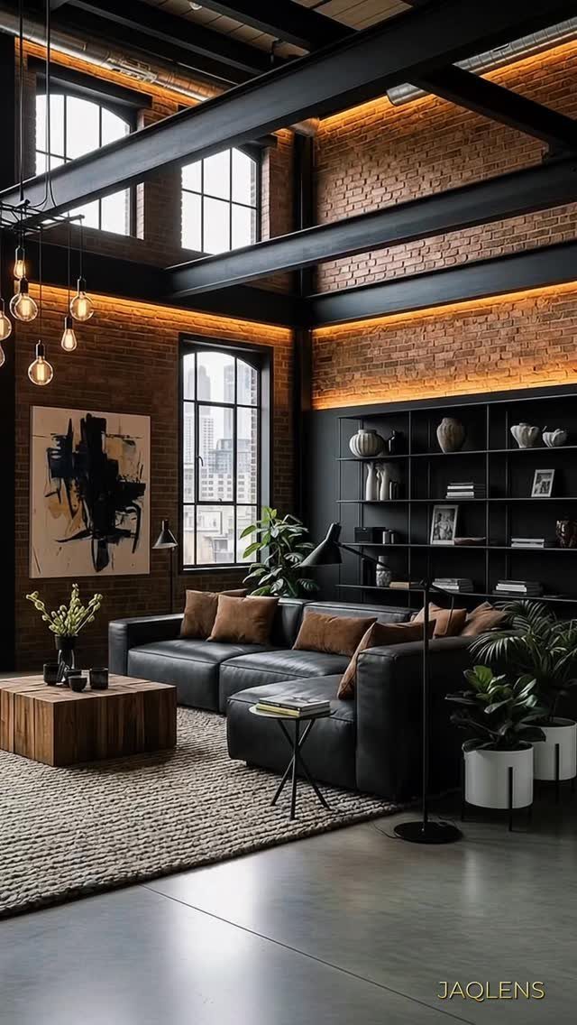
Exposed brick carries weight that paint cannot fake. Real exposed brick carries rough mortar, iron oxide reds, and age in the surface that manufactured panels rarely match.
Check behind drywall in an outer wall of an older house; the brick may be there, waiting.
Painted white brick is the alternative when the tone fights your furniture. White brightens lofts with low light and reads as coastal or Scandinavian where raw brick reads industrial.
White painted brick shows every scuff from moving a sofa, and repainting means cutting in around each mortar joint.
New construction can fake it with brick veneer, but the cost jumps and the depth disappears. Real brick adds thermal mass, slight sound dampening, and a story; veneer adds only looks.
I’d pick raw for a living room where people gather, white for a bedroom that needs to feel larger. Check your structure before you open a wall: load-bearing brick behaves differently than partition, and dust travels.
9. Accent Wall with Stone or Wood
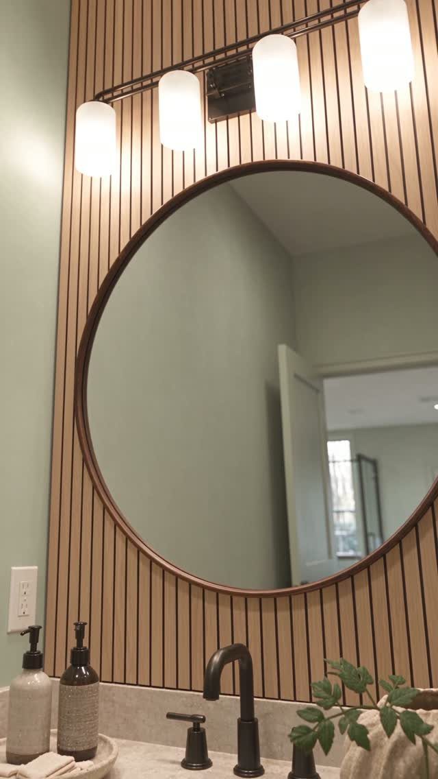
Stone or wood on a wall brings in what the room lacks. Vertical slats of light wood behind a mirror turn a flat bathroom wall into something that catches morning light at different angles.
That variation is the point: flat paint reads the same all day, but slats shift from stripe to shadow as you move.
Pine or poplar slats cost less than hardwoods, and installation needs a level, a nail gun, and patience for the spacing. Stone veneer doubles the price and the weight; verify your wall can carry it before you buy.
Both materials need sealing in bathrooms, where steam swells raw wood and darkens limestone.
This suits spaces where you want calm over drama. The trade is dust in the grooves and the occasional tightening of a board that worked loose.
I’d pick wood for a rental you plan to keep a while; stone for a forever home where the wall outlasts the trend.
10. Blue Board and Batten Accent Wall
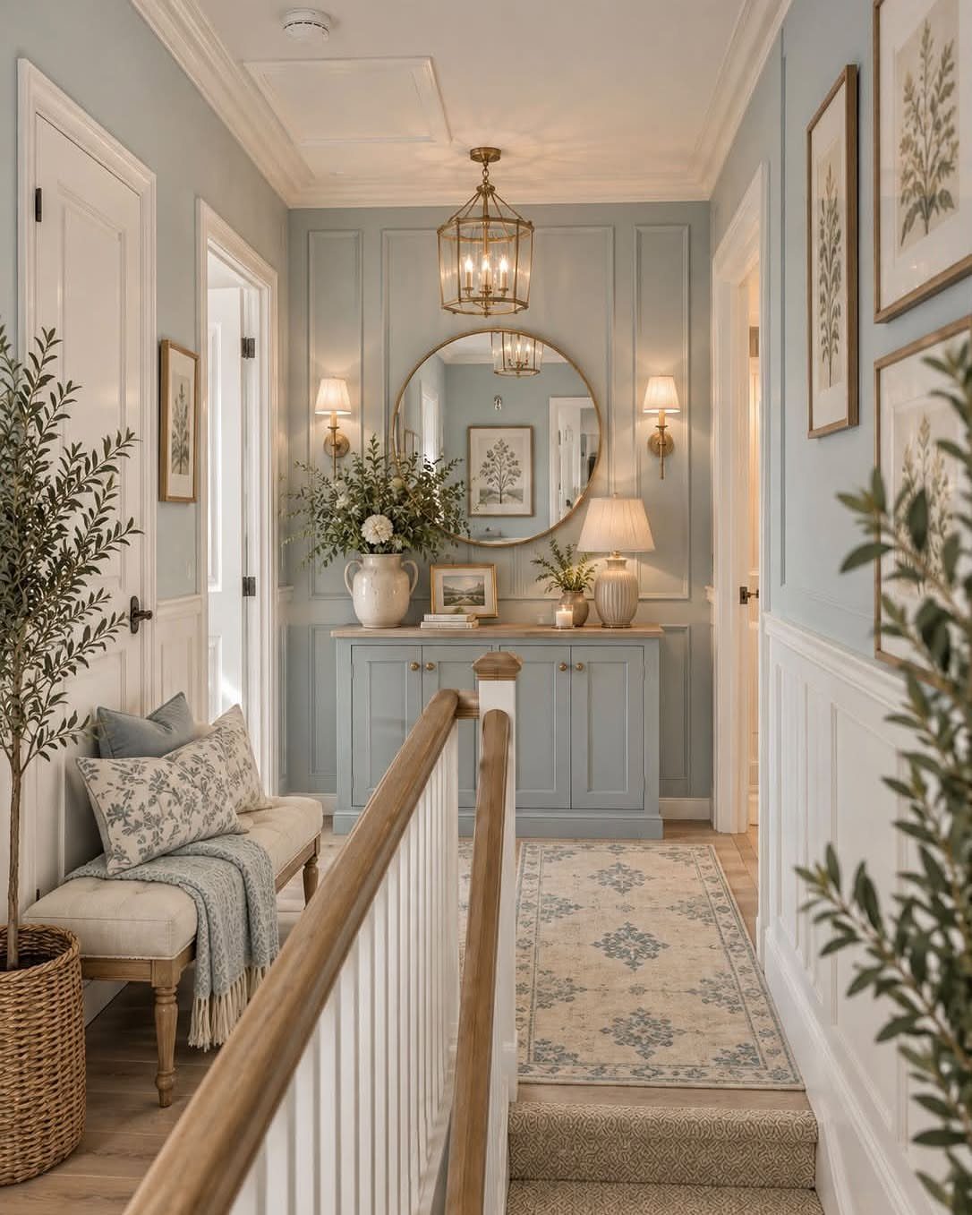
Board and batten is trim carpentry that reads as architecture. A light blue board and batten wall can carry from wall to panel to sideboard, so the molding becomes texture instead of contrast.
The height matters more than the color: stop the battens low for a cottage feel, run them higher for formality, or take them to the ceiling like the New York foyer that inspired this revival.
Paint the boards and battens in one color to emphasize shadow; paint them different from the wall to emphasize geometry.
Deep Royal or Starry Night Blue from Benjamin Moore’s range both work, the first nearly black in low light, the second unmistakably indigo. Either needs two coats on raw MDF or pine, plus primer.
The work takes a weekend: measure, cut battens to length, attach with construction adhesive and finish nails, caulk gaps, paint. A miter saw helps; a hand saw and steady measuring works slower but costs nothing.
This suits entryways where first impressions matter, and it trades the simplicity of flat paint for the rhythm of vertical lines.
11. Accent Wall Behind Sofa
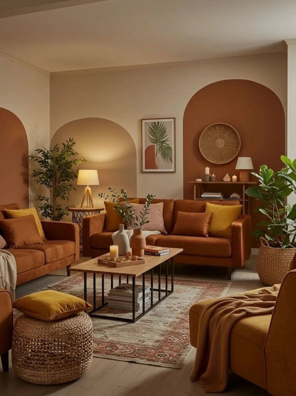
An accent wall behind a sofa solves the problem of a floating room. Large arches painted in terracotta and cream let the wall become art that the sofa frames rather than fights.
The color choice is what makes it: the wall picks up the warm undertone of the leather and pushes against it just enough to read as separate.
The technique is straightforward: mark arch centers with a string and pencil from a nail, tape the curve, roll the fields. Flat or eggshell paint works; semigloss catches light unevenly on a large shape.
One maker used a mural for similar effect behind a bed, taking advantage of a recessed wall to contain the pattern.
Behind a sofa, you have no recess, so the arch scale matters: too small looks like decals, too large overwhelms the furniture.
Dark colors behind dark sofas cozy the room; light colors behind anything expand it. Check your light: north-facing rooms cool every warm tone by afternoon.
I’d pick terracotta for a room that gets morning sun, sage or dusty blue for one that doesn’t.
“There are no hard rules when it comes to accent walls—there are simply too many variables to ever say ‘never,’” explains Cindy Smith, the cofounder of Smith Interiors in Charlotte, North Carolina.
12. Color Blocking Accent Wall
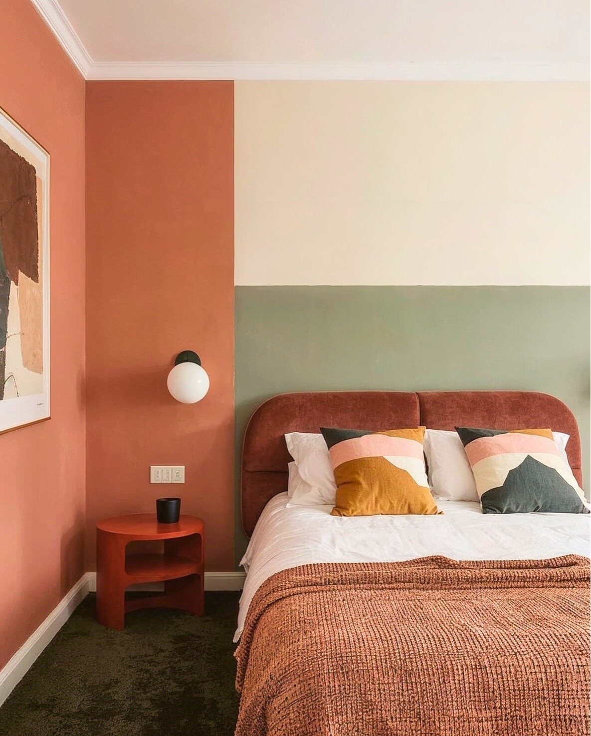
Color blocking is paint as geometry. Divide a wall into three horizontal bands, with the headboard picking up the bottom color so furniture and wall negotiate rather than compete.
The order matters: warm colors advance, cool ones recede, so the terracotta at the bottom grounds the bed while the cream above it lifts the ceiling.
The execution is tape and patience. Paint the lightest color first, let it cure overnight, tape the next band’s edge with painter’s tape pressed firmly, then roll the second color.
Peel tape while the second coat is slightly tacky to avoid tearing. The width ratio is your call; uneven bands add interest, but equal thirds work in a more minimal room.
This suits renters who can repaint later, and anyone bored by single-color walls. The trade is precision: wavy lines ruin the effect, and touch-ups show.
I’d pick muted tones for a bedroom that needs to calm, bold primaries for a child’s space where energy is the point.
13. Pastel Toned Accent Wall
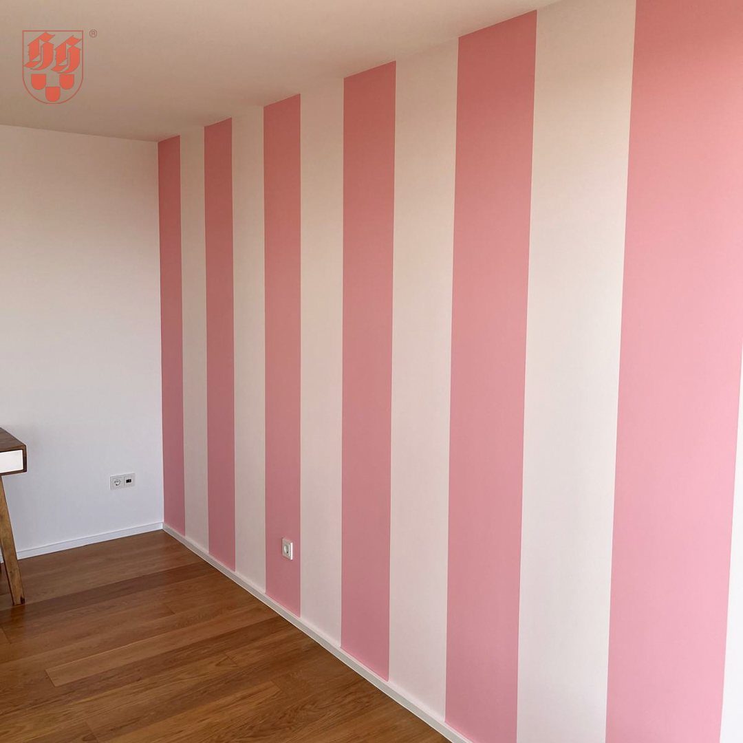
Vertical stripes in pastel pink and white turn a single wall into a quiet backdrop without the commitment of wallpaper. The alternating bands draw the eye upward, which helps rooms with standard ceilings feel a touch taller.
Paint keeps the cost around a gallon or two and a roll of good masking tape. I’d start with the white base coat, let it cure overnight, then mark vertical lines with a level at even intervals.
Tape outside the pink sections, paint two thin coats, and pull the tape while the second coat is still tacky.
This suits bedrooms and home offices where you want character without energy. Wobbly lines read as sloppy, not soft, so this one rewards a steady hand.
14. Two-Tone Accent Wall
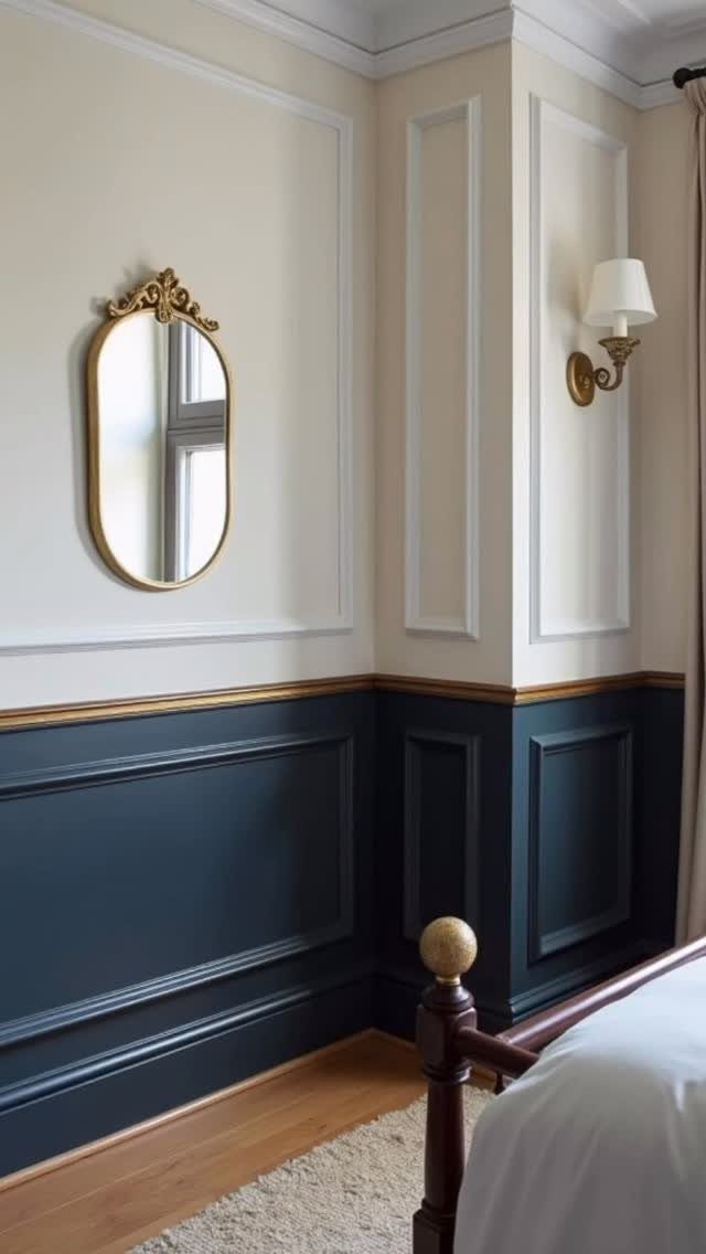
The effect reads as wainscoting without the carpentry, which matters when your weekend is Saturday and Sunday.
Two-tone work succeeds or fails at the transition line. Paint the darker color first, let it dry completely, then run blue painter’s tape along a level line before brushing the lighter shade.
Peel the tape back at an angle to keep the edge sharp. Samples from a peel-and-stick service let you test both colors side by side before committing to gallons.
I’d steer this toward teenagers’ rooms or rental dining areas where you want impact without permanence. The darker lower half forgives scuffs from chairs and passing bags.
15. Terracotta Living Room Accent Wall
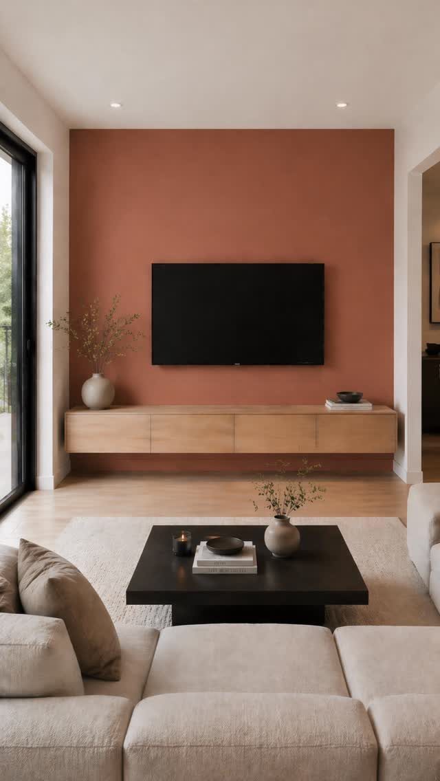
Terracotta warms a living room wall without the heaviness of brick or stone. Against light wood and neutral upholstery, it reads as sunlight even on gray afternoons.
One matte gallon covers a standard accent wall with two coats to spare. I roll the field first, then cut in around the television mount and outlets with a small angled brush.
The color shifts dramatically with natural versus artificial light, so I always test a patch and live with it from morning to evening.
This works best in rooms that already get some sun; in a north-facing space the orange can turn muddy. Pair with plants, rattan, or black metal frames for a grounded look that does not lean too southwestern.
16. Painted Wall Panel Molding
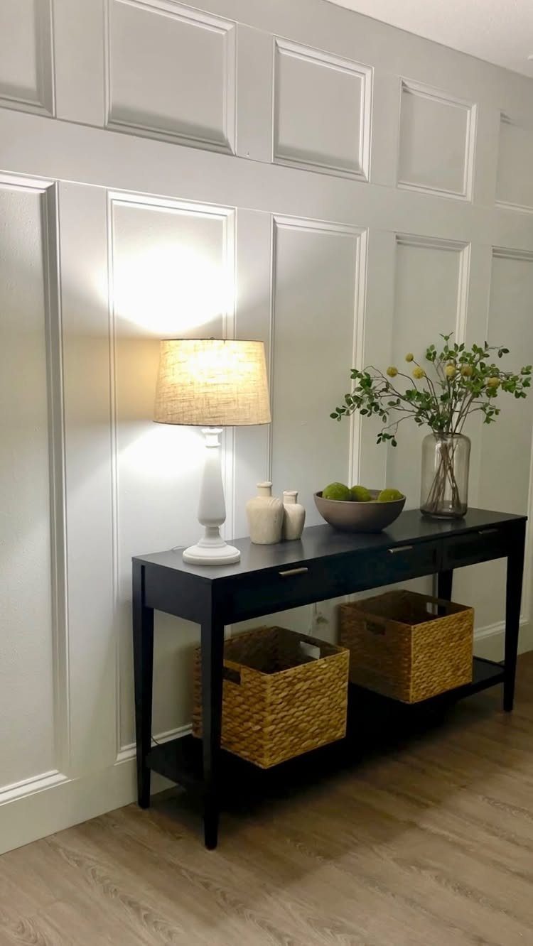
Rectangular molding and wainscoting give a flat wall the shadow lines of custom millwork. The light grey paint unifies everything so the geometry, not the color, does the talking.
You can buy pre-primed MDF strips at any home center, cut them with a miter box, and attach with construction adhesive and a brad nailer.
I lay out the boxes with a level and painter’s tape first, stepping back to check proportions before anything is permanent.
The dip between panels that the builder noted adds depth; I leave those recessed areas in the wall color or go one shade lighter, never darker.
17. Painted Arch Accent Wall
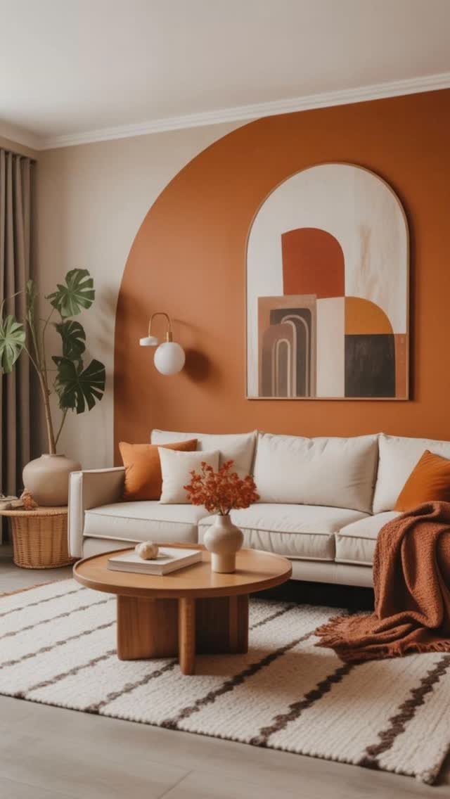
A single painted arch frames the sofa like a proscenium, turning a blank wall into architecture. No molding, no wallpaper paste, just a steady hand with a pencil string and two quarts of paint.
I tie a string to a pencil, anchor the other end where I want the arch center, and swing the arc in one motion.
Frog tape follows the line; I paint the terracotta field first, then remove the tape to reveal a crisp edge against the neutral base.
The scale should feel almost too large when you sketch it; furniture shrinks the effect once everything is in place.
This suits renters and commitment-phobes. When you move or tire of it, one coat of base color erases the shape entirely.
18. Charcoal Grey TV Accent Wall
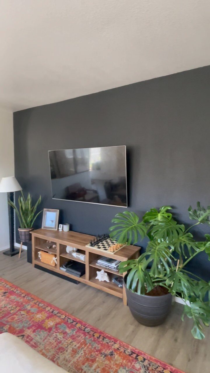
Charcoal grey absorbs the television’s black rectangle instead of fighting it, so the screen disappears when off and the wall feels intentional rather than accidental. The surrounding plants and patterned rug keep the mood from turning cave-like.
Matte or eggshell finish matters here. Gloss catches lamp glare and competes with the screen; flat paint recedes.
I roll two coats and keep a small brush handy for touch-ups around the mount, since charcoal shows every scuff from cable management.
This is the choice for open-plan living rooms where the sofa faces the wall by necessity, not choice.
The risk is darkness in a room with small windows or northern exposure; add a warm wood console and brass or rattan accents to keep it livable.
19. Vibrant Yellow Accent Wall
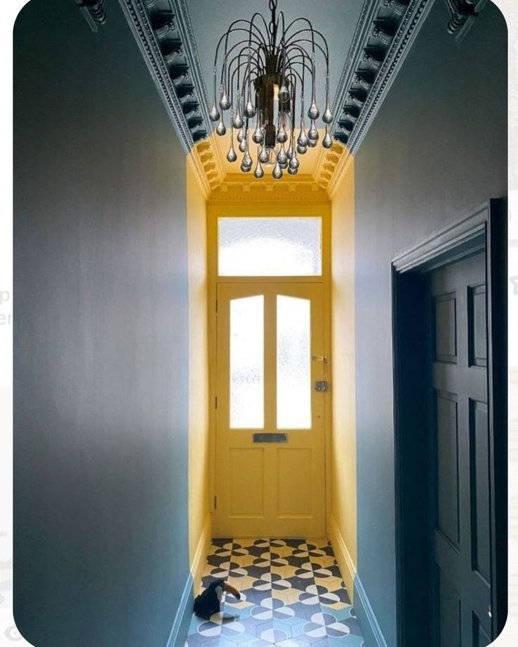
A yellow accent wall reads cheerful in small doses, and this hallway keeps the dose tight: one end wall, the door, and a ceiling recess, all in the same warm tone, surrounded by cooler blue that lets the yellow pop without shouting through the whole house.
The paint color matters more here than with muted shades.
York Harbor Yellow 2154-40 by Benjamin Moore sits right in the middle, not too loud, not too soft; if your windows throw a lot of sun, Golden Retriever 2165-30 has enough weight to hold up against it.
Either way, test it at the hour you actually use the space. Warm bulbs coax out the coziness in yellow, while daylight bulbs flatten it toward caution-tape territory.
I would only put this in a transitional space like a hallway, a reading nook, or a kitchen corner that sees you in the morning. In a full living room, the saturation tires fast.
Yellow does not forgive sloppy edges. Every brush mark shows, so I budget for two coats and set aside a calm hour for the cut-ins where the wall meets the ceiling and trim.
Choosing the Right Wall
The wall behind your bed, fireplace, or television already draws the eye; paint just makes it official. If the room has no obvious anchor, stand in the doorway and notice where your attention lands first.
A solid stretch of wall without breaks for windows or doors holds the color better and reads as one intentional shape.
The breaks chop the color into fragments, and your eye reads the wall as busy before it reads the paint.
A solid stretch of drywall gives the color room to work. In an open plan, I would pick the wall that faces the main entrance, not a side wall that hides behind furniture.
Pick the wall your eye lands on naturally from the spots where you actually sit or walk.
Lighting Considerations
Natural light shows paint at its truest. Morning sun on east-facing walls warms the color; afternoon western light can bleach it.
The same gallon reads different by the hour.
Artificial light alters what you chose. Incandescent bulbs or warm LEDs push colors toward yellow and coziness.
Daylight bulbs sharpen blues and greens into something cooler and more modern. Dim lighting deepens a dark accent wall; bright overhead light softens it.
I would test samples under every bulb the room uses, not just the window light you prefer. A wall that glows at 10 a.m. can flatten to mud under a ceiling fixture.
Color Psychology
Warm colors advance. A terracotta or deep orange wall pulls the surface toward you, which shrinks the space and wraps it close.
That coziness works in bedrooms and living rooms where you want to settle in.
Cool colors recede. Blues and greens push the wall away visually, which expands the room and lowers the pulse.
That relaxation suits offices and bedrooms where the goal is calm.
The choice is not universal prescription. Your own response to a color matters more than the theory.
But the direction is real: a warm accent wall behind a sofa invites conversation, a cool one behind a desk invites focus.
Testing Paint Colors
Paint a sample patch and live with it for 2 days. The color at 9 a.m. is not the color at 9 p.m., and morning enthusiasm for a bold choice can cool by evening.
Peel-and-stick samples let you move the test around the wall. I would place one where direct sun hits, another in shadow, and a third near the floor where the light falls dimmest.
I held the same swatch against my bedroom wall at noon and again at 6 PM and thought I was looking at two different colors.
Let the base coat cure overnight before judging. Wet paint darkens as it dries, and the true value only shows after a full day.
Two coats on the final patch, not one, or you are guessing at coverage you will not get.
Frequently Asked Questions
What is the best paint color for an accent wall?
There is no single best color; the right choice depends on what the room needs. A white headboard against navy looks deliberate, terracotta pulls light into a living room on overcast days, and charcoal grey hides a TV’s black box.
Paint a test patch and watch it through a full day, because the same color can look like two different ones under morning sun and evening lamps.
Are accent walls out of style in 2026?
No, accent walls remain a popular design choice. Bold and rich colors like deep blues, emerald greens, and earthy terracotta are trending for 2025, and the technique of adding dimension through a single painted wall shows no sign of fading.
Pick a wall that already draws the eye, so the color answers something the room needs instead of shouting for attention on its own.