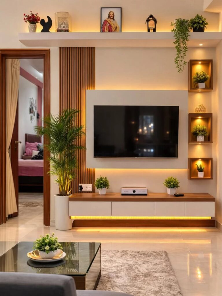
The ideas below range from plate hangers to textured panels or original canvas, and the deciding factor is how long you plan to stay in the space.
A renter patching nail holes needs a different wall than a homeowner ready to cut slats and lose the ability to hang anything there.
The gap between slats is what creates the shadow line that reads as texture or stripe depending on paint choice.
1. Gallery Wall
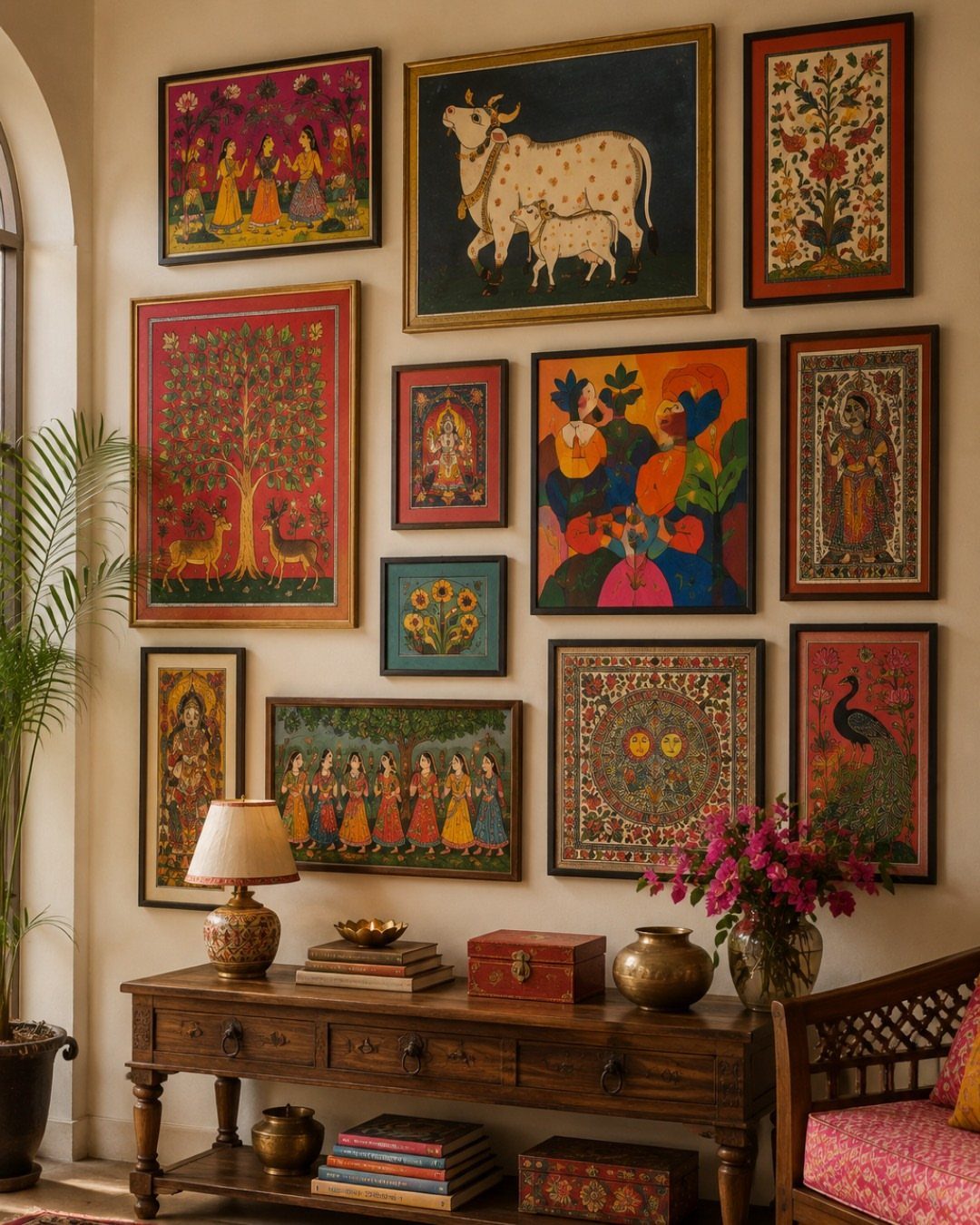
A gallery wall turns the living room into something no one else can copy. I started mine with a single frame I already owned and built outward, which saved me from the paralysis of planning the whole grid at once.
Mix sizes freely: a large horizontal piece anchors the center, and smaller frames fill the gaps like puzzle pieces.
The frames do not need to match; mine are half thrifted, half bought on sale, and the mismatch is what makes it look collected rather than catalog-ordered.
Leave some space between pieces so the wall can breathe. This suits renters who can patch small nail holes before moving out, and anyone with a drawer of unhung art waiting for permission.
2. Decorative Wall Plates
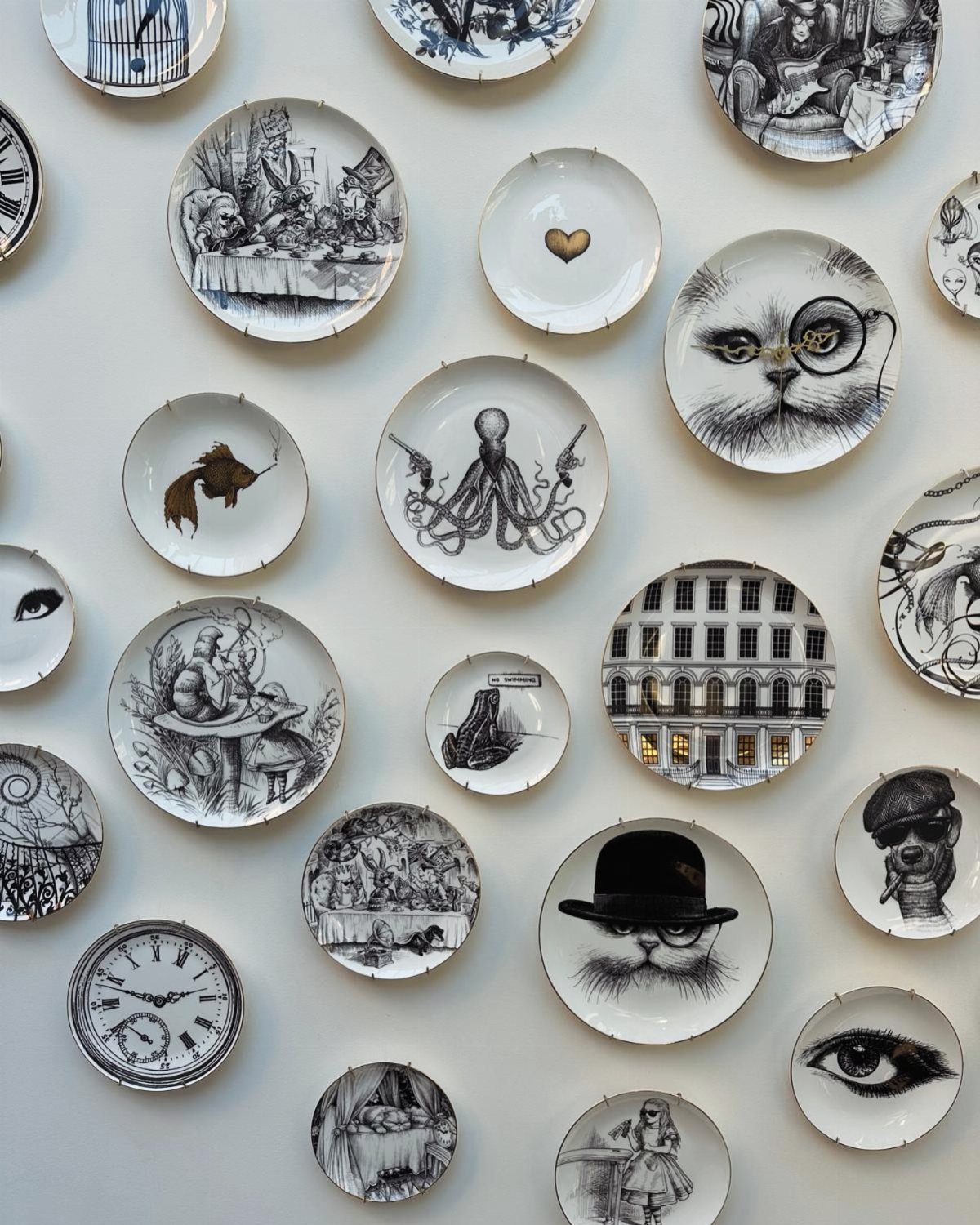
Decorative plates read as color and shape without the weight of heavy frames.
I hung mine on plate hangers from the hardware store, the wire kind that hooks over the rim and hides behind. They cost next to nothing each and leave a smaller mark than a frame’s sawtooth bracket.
Arrange on the floor first, or trace each plate onto newspaper and tape the shapes to the wall. This idea suits walls too narrow for furniture or anyone with a collection of single beautiful dishes that never see the table.
3. Floating Shelves
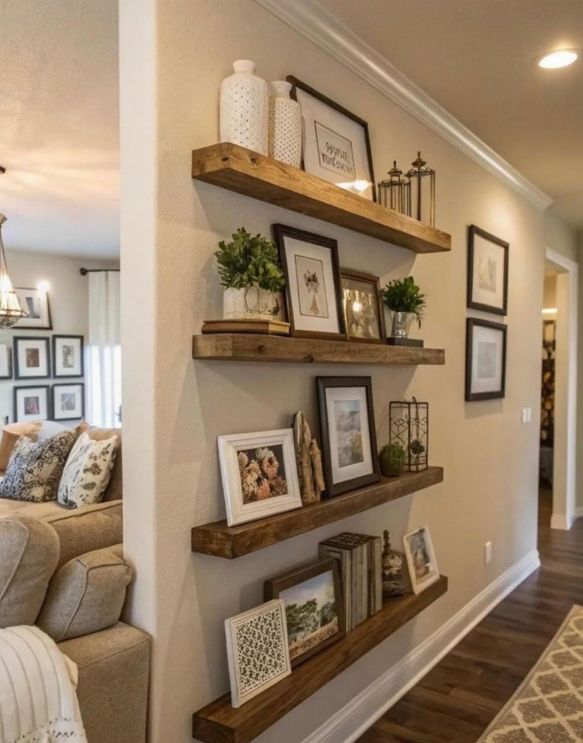
Floating shelves let the wall itself stay visible, which matters in a small room where solid shelving would close the space in. Painted shelves would disappear into a white wall if that is what your room needs.
I install mine into studs when I can find them, and use toggle anchors rated for a decent weight when I cannot. The gap between shelf and wall is where the bracket hides, so dust there quarterly or it shows.
These work best for objects you want to rotate: a plant that outgrows its spot, a book you finish. The wall becomes a changing display rather than a fixed commitment.
Add a small LED strip underneath if you want the warm glow the green-wall variation shows, though that adds a weekend of wiring.
4. Textured Wall Panels
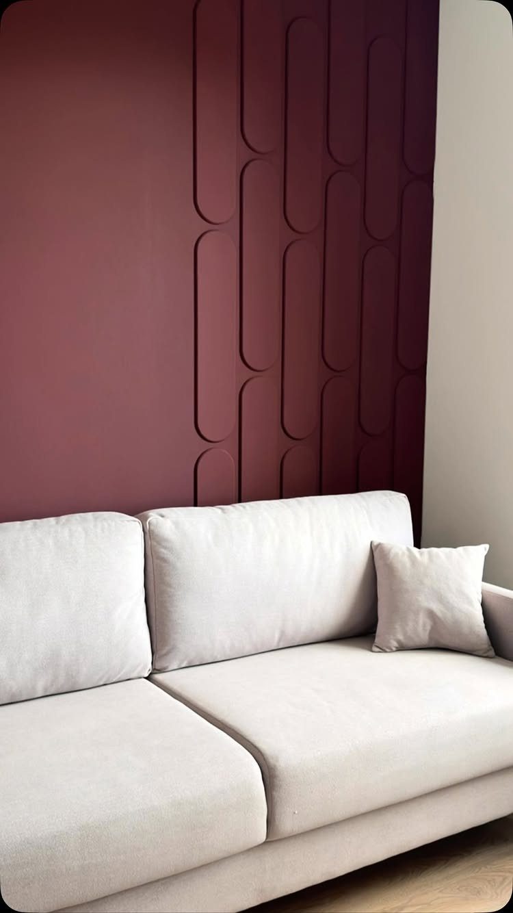
Textured wall panels are the closest a renter can get to architectural detail without touching the drywall structure.
PVC panels with wave or pill-shaped ridges go up with construction adhesive and a few finish nails; I have also seen peel-and-back versions that come down intact.
Wood-grain options warm up a room that faces north and never gets direct sun.
Cost runs higher than paint, and the seams need attention or they telegraph through. This suits someone staying put for a few years, or a homeowner who wants the feature-wall effect without the plasterer’s bill.
Choose low-profile patterns behind a sofa; busy texture fights with anything you lean there.
5. Large Painting
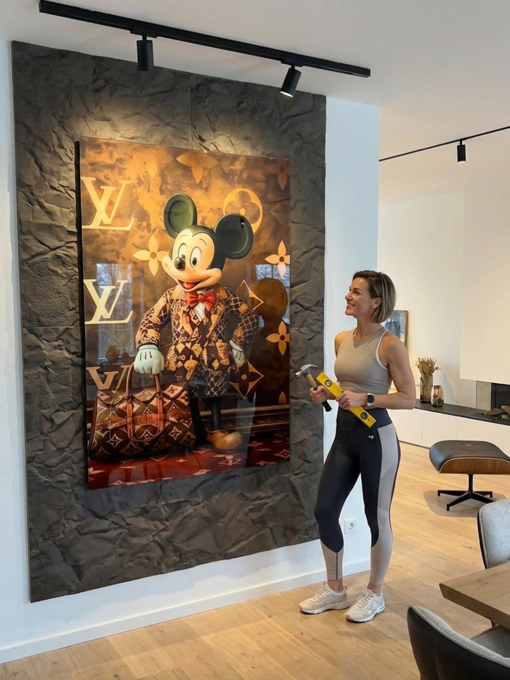
A single large painting does the work of several small frames and one decision.
I center mine at eye height from the floor to the middle of the canvas, which lands at a natural spot whether the viewer stands or sits.
Surround it with smaller pieces only if the wall is wide enough to give the large work breathing room on each side; otherwise let it stand alone.
This is the fastest entry on the list and the most expensive if you buy original art. Prints on canvas keep the budget reasonable.
It suits anyone who has collected small frames for years and still has a blank wall that defeats them.
6. Wooden Slat Wall
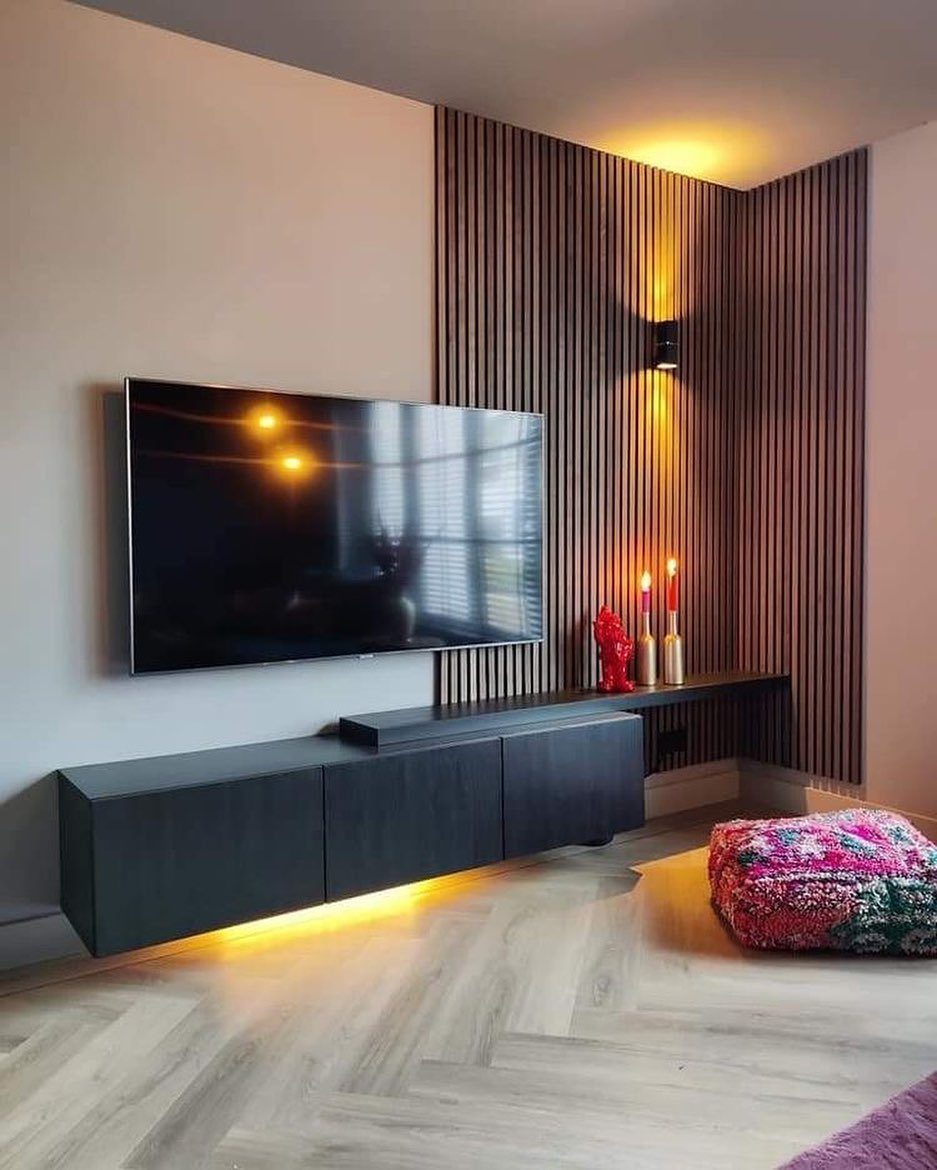
Wooden slats add rhythm to a wall the way floorboards add rhythm to a room.
I cut slats from 1×2 pine and space them 1/2 inch apart on a backing frame of the same material, painted to match the wall behind.
The shadow between slats does the visual work; paint them dark and the gaps read as stripes, light and they read as texture.
Skip the light and you still get the acoustic softening that bare drywall lacks. This trades away the ability to hang anything on that wall, so choose a spot where the slats are the whole statement.
7. Monogram Wall
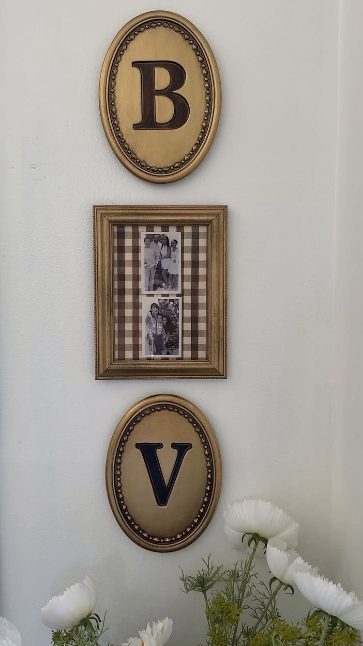
A monogram wall turns your own initials into the art, which is why it hits different from anything store-bought.
Painted wooden letters from a craft store, metal marquee letters, or even paper mache shapes wrapped in twine all work for this idea.
Sizing matters most: one oversized letter reads as graphic and modern, while a cluster of family initials feels more collected and traditional.
I would check the wall space you actually have before buying, since an oversized letter eats more room than most people guess and needs to anchor the arrangement alone.
This one suits renters who want personalization without holes for shelving, or anyone tired of hunting for "meaningful" art. The trade is that your initials stay your initials; it works best for a household name that will not change.
8. Framed Botanical Prints
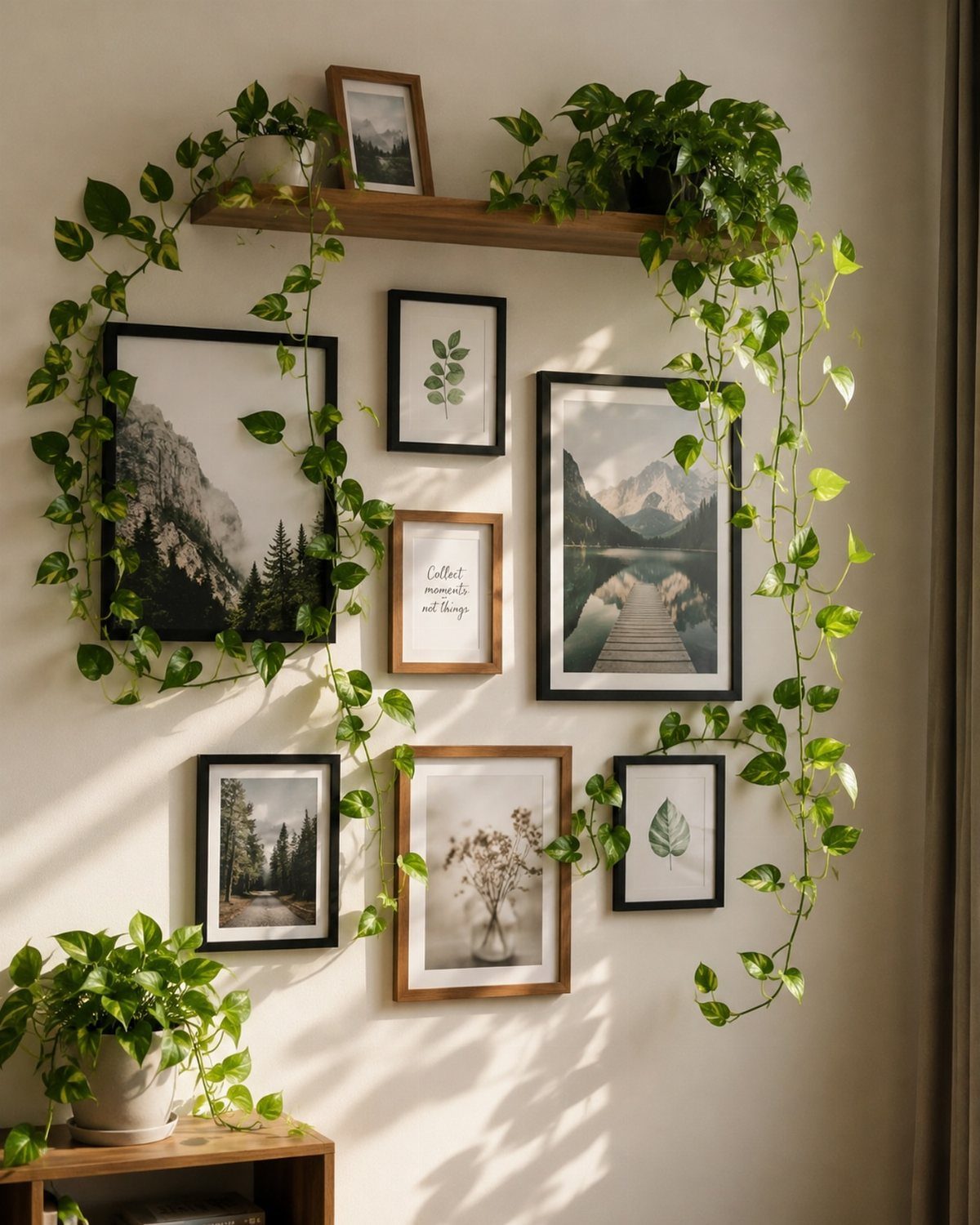
Framed botanical prints bring in the green without the watering schedule, and they layer well with real plants if you already tend those. Prints below and living vines above keeps neither fighting for attention.
I would mix frame finishes on purpose rather than matching them, since identical frames can turn a plant wall into a dentist’s office.
Thrift stores and estate sales are where I find the old floral prints worth framing; the free printable versions online tend to print flat and need heavier paper to look like anything.
This idea stretches a small budget the farthest when you start with foraged clippings pressed in a book until they dry flat, then frame them yourself.
It suits the reader who wants calm over clutter, though it reads as safe rather than daring; pair it with one bolder piece if your room needs energy.
Creating a Focal Point
A focal point needs room to land. Center your largest piece at eye height, measured from the floor to the middle of the canvas, and let smaller frames or sconces sit outside its breathing room rather than crowding it.
An olive green wall behind a large landscape painting gives the eye a place to rest before it travels outward to the smaller sketches. Gold sconces on either side warm the arrangement without competing.
If your furniture faces the wall, keep the seating far enough back that the whole arrangement reads at once. Too close and the viewer processes pieces one by one instead of as a single statement.
Mixing Textures
Texture lives in the gap between materials, not in any single one. A wooden slat wall beside a metal-framed botanical print gives the eye two surfaces to compare, and the contrast makes both more interesting than either would be alone.
Fabric matters too. A textile piece, even a framed scrap of vintage linen, softens the hard edges that wood and metal bring.
I would hang it where it catches side light from a window; shadow does more to show texture than direct overhead lighting ever could.
The backing of a gallery wall can carry texture if you skip flat paint. A wall with subtle depth behind flat frames reads as intentional, not unfinished.
Personalizing Decor
Personal does not have to mean private.
The mismatch is the point; it looks gathered over time rather than ordered in one click.
Using Color Effectively
Color works in relationships, not in isolation. An olive green wall suits gold sconces and warm wood frames because they share a yellow undertone; cool silver against that same green would fight.
A white wall behind floating shelves lets the objects carry the color and change with the season.
The same prints on a sun-baked south wall can look faded by comparison; there I would go darker or more saturated.
Test your color at the actual time of day you use the room. Morning light and lamplight read the same paint as two different walls.
Frequently Asked Questions
What is the latest trend for wall decor?
Textured wall panels and gallery walls are what I see most right now. A gallery wall built from mixed frames, half thrifted and half bought on sale, reads collected rather than catalog-ordered.
What is the best wall decor for a living room?
A single large painting does the most work with one decision; center it at eye height and let it stand alone if the wall is narrow.