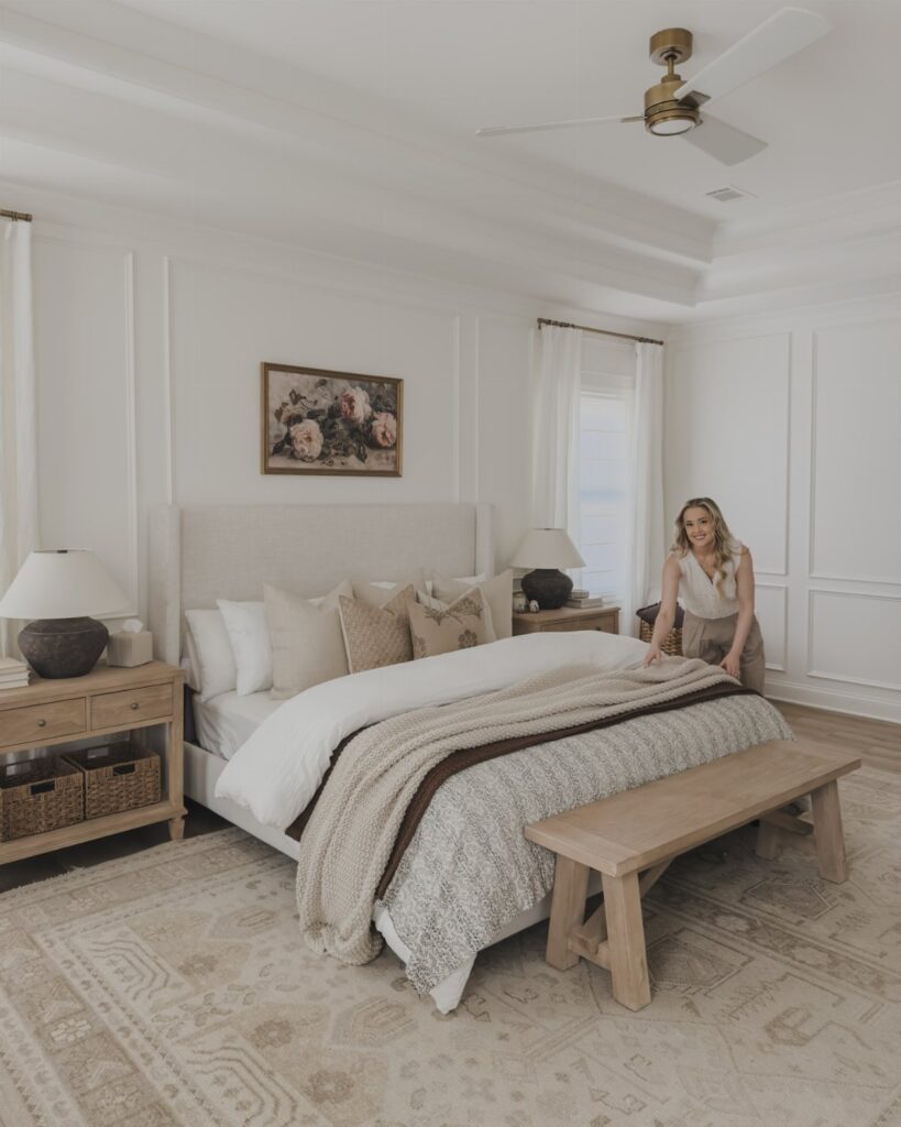
Wainscoting bedroom walls can be a weekend of pine boards and a brad nailer or raised panel work that calls for a finish carpenter and quarter-sawn oak.
The deciding factor is not budget alone but how much permanence the room can handle; vertical slats come back down with minimal patchwork, while raised panels need seasonal humidity considered before the first cut.
Where navy commits harder than gray, dusty pink stays guest-ready without going saccharine, and the difference between them is as much about what happens in the rest of the house as what happens on that one wall.
1. Vertical Wood Slats
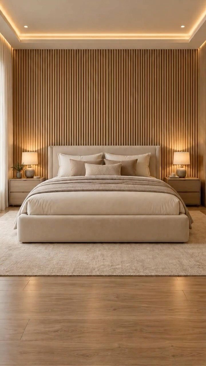
Vertical slats draw the eye up and make a low ceiling feel taller than it is.
I have seen them run floor-to-ceiling behind a bed for a full accent wall, or stop at chair-rail height with paint above for a lighter take on the same idea.
Sage green or navy blue paint behind natural wood slats changes the whole mood of a bedroom.
A brad nailer and 1×2 boards from any home center will get you there in a weekend; the wall width drives the final cost more than anything else.
This one suits renters who want impact without permanence, since the slats can come down with minimal patchwork.
2. Cream Wall Panels
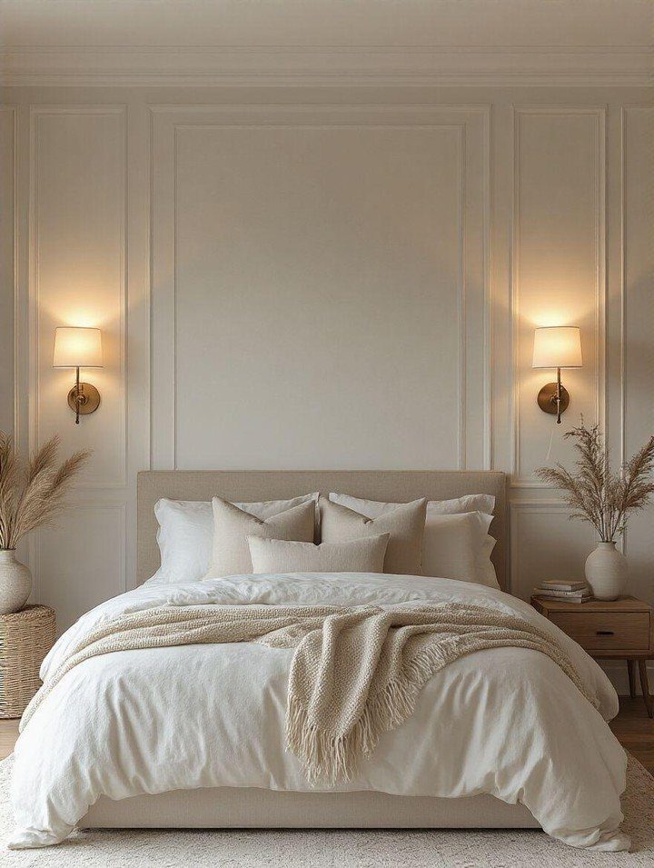
Cream panels with raised rectangular molding feel like a quiet upgrade rather than a renovation. When the color matches the wall this closely, the panels read almost as architecture, not decoration.
I would keep the tone-on-tone approach if the room gets strong natural light; otherwise the detail disappears. For contrast, paint the upper wall 2 shades deeper in the same family.
Picture-frame molding in pre-primed pine needs adhesive and a miter saw rental, so budget for the tool cost on top of the material. It suits someone who wants formality without dark wood or heavy color.
3. Navy Blue Paneling
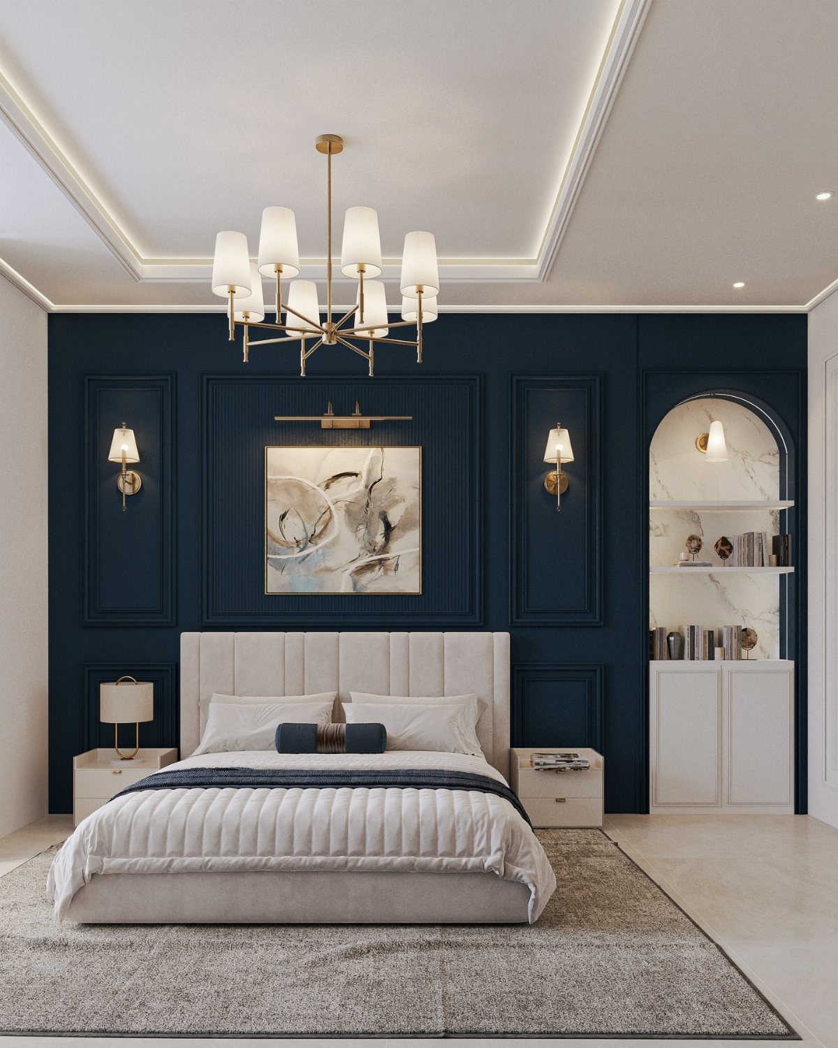
Navy on the lower half of a wall trades the usual safe neutrality for something that actually wakes you up when you walk in.
The same navy blue in vertical wood paneling stopped at chair-rail height gives you the boldness while keeping the room from feeling boxed in. Matte finish reads richer than satin here.
Pair it with brass hardware and white linens, as above, or let it ground a room full of pattern and vintage finds. This choice sacrifices some flexibility; navy commits harder than gray or cream if you tire of it.
4. Raised Panel Wainscoting
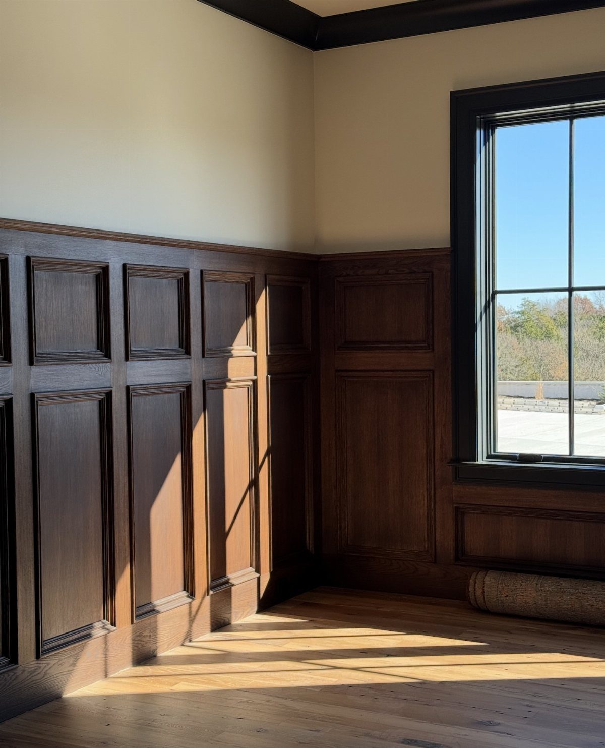
Raised panels project out from the wall surface enough to catch shadow and light in a way flat trim cannot match. Dark stained oak gives a library quality; in cream paint the same profile reads softer but still formal.
Quarter-sawn oak holds up better than plain-sawn in dry mountain air, if that is your climate, because the grain resists cupping. Installation demands more precision than beadboard; the stiles and rails must meet square or the whole grid looks off.
A finish carpenter charges accordingly, so this is the one to save for a room where you spend real time.
5. Flat Panel Wainscoting
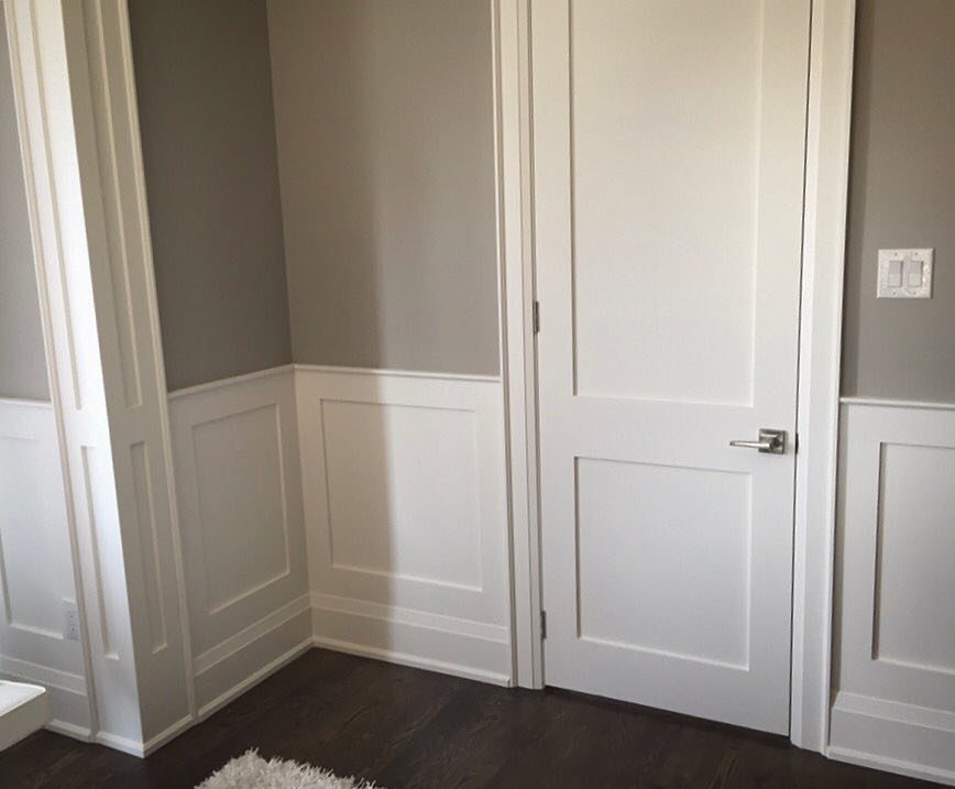
Recessed panels framed by simple stiles and rails give you the structure of traditional wainscoting without the fuss of raised molding or beadboard grooves.
Paint the panels and frames the same color as the wall for a quieter look, or contrast them if the room needs definition. It bridges traditional and contemporary furnishings better than raised paneling, which tends to drag toward formality.
Standard rail height works for most ceilings; go higher if you have the vertical space to support it. Order matters less here than with raised panels; a competent DIYer can manage the cuts over a weekend.
6. Beadboard Wainscoting
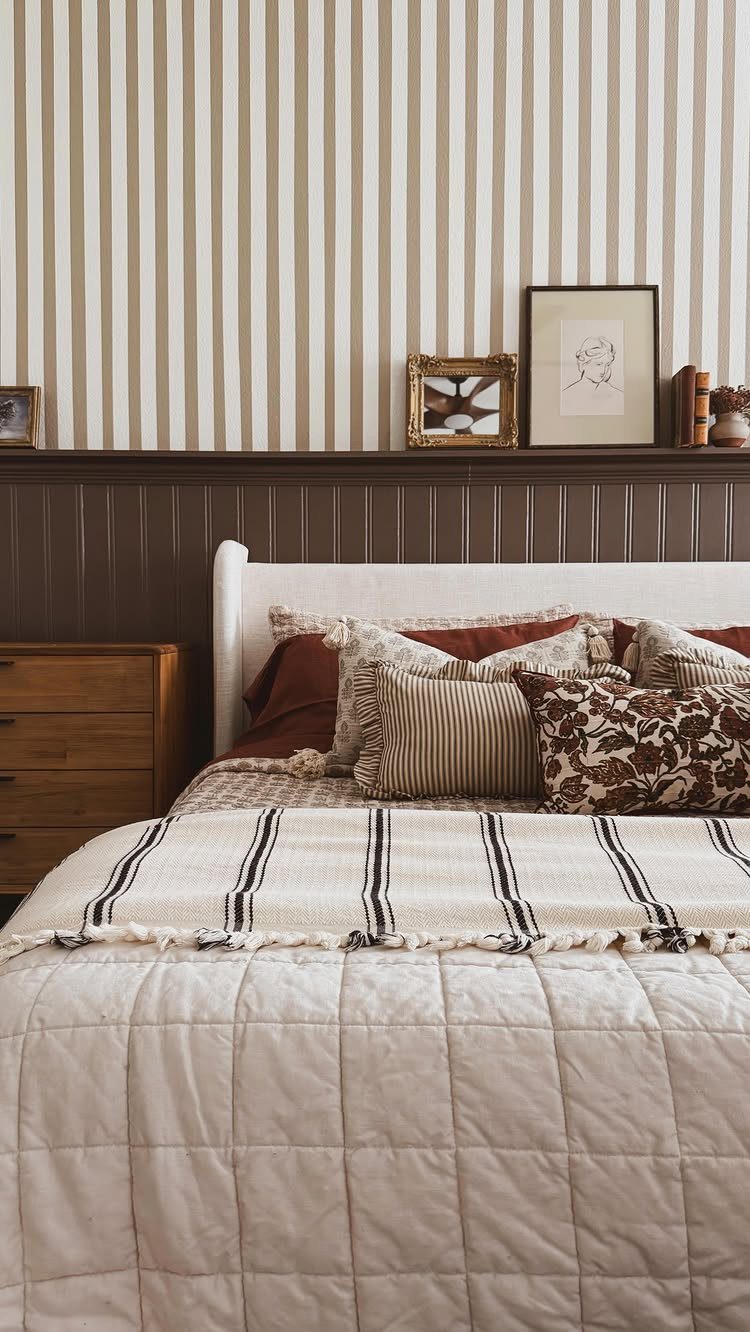
Vertical grooves spaced tight together give beadboard a rhythm that reads casual even when painted dark. In most bedrooms I would pair beadboard with solid paint above to let the texture do the work.
Composite beadboard, meant for bathrooms and mud rooms, holds up to vacuum bumps and suitcase scrapes better than wood in a guest room you actually use.
Material cost for a full beadboard wall depends more on the span you are covering than on the board price itself.
It trades the crisp geometry of board-and-batten for something softer; pick this if your house already leans cottage or coastal.
7. Board-and-Batten
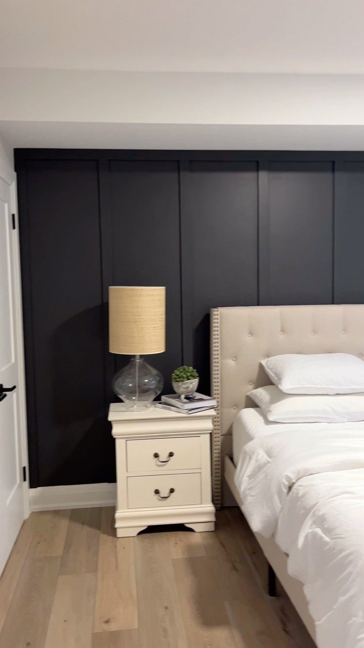
Board-and-batten started as mountain siding, wide boards with narrow strips nailed over the gaps to keep the weather out.
The vertical rhythm it leaves behind still reads as architecture rather than decoration, which is why it works behind a headboard where you want presence without fuss.
For a weekend build, 1×8 or 1×10 boards run floor to ceiling with 1×2 battens spaced evenly apart. Pine runs cheap; paint covers the knots.
Reclaimed wood costs more but needs no backstory added. Charcoal paint works, though navy reads almost as dark and hides uneven walls better.
This one suits renters who can patch screw holes later, or owners who want one wall with weight instead of wallpaper.
It trades away subtlety; in a small room, keep it to the wall you face from bed and leave the rest quiet.
8. Geometric Panel Wainscoting
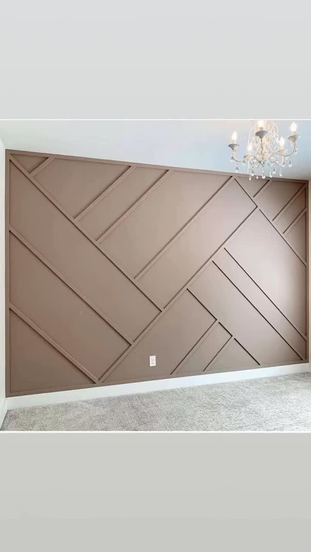
Geometric paneling starts with the same rectangular molding boxes everyone knows, then cuts diagonals through them or tilts the whole grid. Intersecting slats build diamonds and rectangles in one plane; no raised panels, just shadow.
Installation order matters. Map the pattern on paper first, then transfer to the wall in chalk.
MDF takes paint smoothly and resists the seasonal swelling that can split mitered corners in solid wood, which matters if this is a second home that sits empty through wet months.
Engineered products with hardwood veneer cost more upfront but stay flat.
The look commands attention, so it needs editing everywhere else. Plain bedding, no competing patterns, one sculptural light.
I’d skip it in a narrow room; the angles close the space in.
9. Dusty Pink Molding
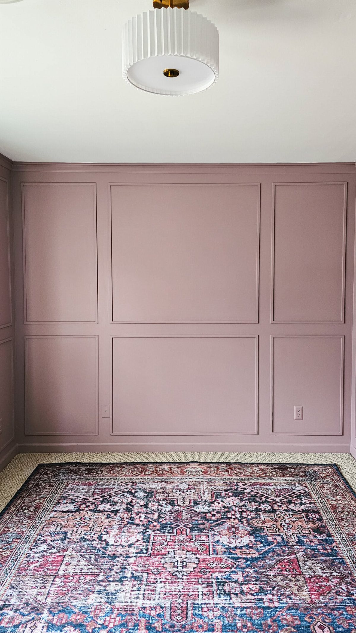
Dusty pink on molding is the color decision doing the work here, not the grid itself. The panels reach two-thirds up the wall, standard chair-rail height stretched taller, which keeps the proportion from feeling institutional.
Paint the molding and the wall inside each box the same shade; matching trim to field is what makes this read as carved plaster rather than applied wood.
A patterned rug adds the contrast, so the wall can stay soft without going saccharine. For paint, start with a sample pot on a 2-foot square; dusty pink shifts toward peach or lavender under warm LEDs versus north light.
This one wins for bedrooms that share a bath or hall with white millwork elsewhere. The pink stays contained, guest-ready, not thematic.
If the rest of your house runs neutral, this is where personality lives without apology.
Frequently Asked Questions
Does wainscoting look good in a bedroom?
It can take a bedroom from fine to genuinely better by adding texture and architectural presence that paint alone cannot match.
Beadboard reads casual, raised panels read formal, and board-and-batten lands somewhere between, so the right choice depends on how you actually use the room.
What is the golden rule for wainscoting?
Standard rail height works for most ceilings, and you should go higher only if you have the vertical space to support it.
For dusty pink molding, I’d stretch chair-rail height to two-thirds of the wall; anything lower starts to look like a hospital corridor. The wall width drives cost more than anything else, so measure carefully before you buy material.
What are some trendy bedroom wall ideas for 2026?
Geometric paneling with intersecting slats that build diamonds and rectangles is showing up more, along with bold colors like navy and dusty pink on molding rather than safe neutrals.
Vertical wood slats in sage green or navy behind natural wood are another direction that feels current without being tied to one season.
These ideas survive a real budget and a weekend timeline, which matters more than whether they appeared in a trend forecast.